Managing Components
This article explains how to manage a component in Prepr. A component is a predefined set of fields that can be used in models.
Create a component
To create a component, follow these steps:
- Click the Schema tab to open the Schema Editor.
- Then, click the + Add component button.
- Name the component as follows Or import a component:
| General fields | Description |
|---|---|
| Display name | Choose a unique name for the component. |
| Type name | The value of this field is automatically generated. This field is important for the GraphQL API to connect your front-end to Prepr. When you create a new component, this name is generated as follows: PascalCase version of the Display name, stripped of all non-alphanumeric characters. For example, the component name "SEO tags" generates SEOTags. |
| Icon | Choose an icon image that visually represents your component. This is used for the dynamic content editor and other parts of the content item editor interface. |
After creating a component, you can include a component in a model. The following model fields allow you to use your component in a model:
- Component field: This field type allows the model to include the component.
- Dynamic content field: This field type allows the component fields to be available in the Dynamic Content Editor. Check out the Dynamic Content field type for more details.
- Stack field: This field type allows the model to include multiple components and models.
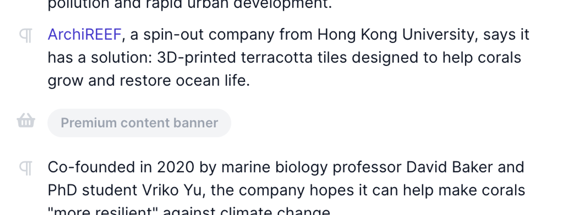
Create empty components to serve as placeholders. This way you can trigger the front-end to insert static front-end components, such as banners, marketing widgets, or forms. An empty component is a component without any fields. All empty components in a dynamic content field are shown as a label so you can easily recognize them.
See an example empty component used as a placeholder, below:
When someone else is working on the same schema, for example, they add a new component or delete an existing component, you'll see those changes in real-time within the schema editor.
Duplicate a component
In some cases you can duplicate a component to save time when you want to create a component that is similar to an existing one.
To duplicate an existing component follow the steps below.
- Click the Schema tab to open the Schema Editor.
- Click the component you want to copy.
- Click the button at the top of the component.
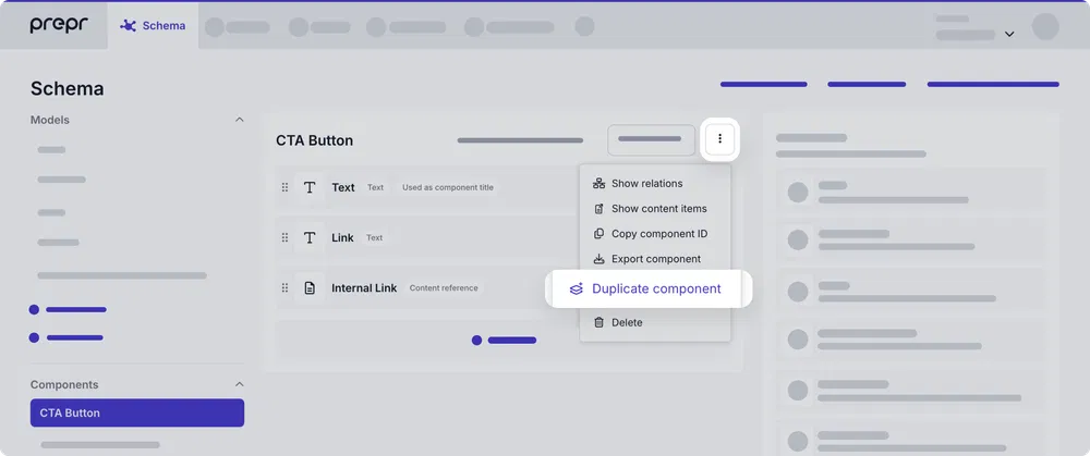
- Click the Duplicate component option. The duplicate process is an automatic export and import of the component.
- Once done, click the Close button.
You'll see the duplicated component in the schema with (Copy) in the name. You can then rename and edit the duplicated component, as needed. For example, remove fields or add new fields.
Manage settings
To change settings for a component, follow these steps:
- Click the Schema tab to open the Schema Editor.
- Click the component from the list of components on the left.
- At the top of the components, click Settings to open the setting options for a component.
The following settings are available:
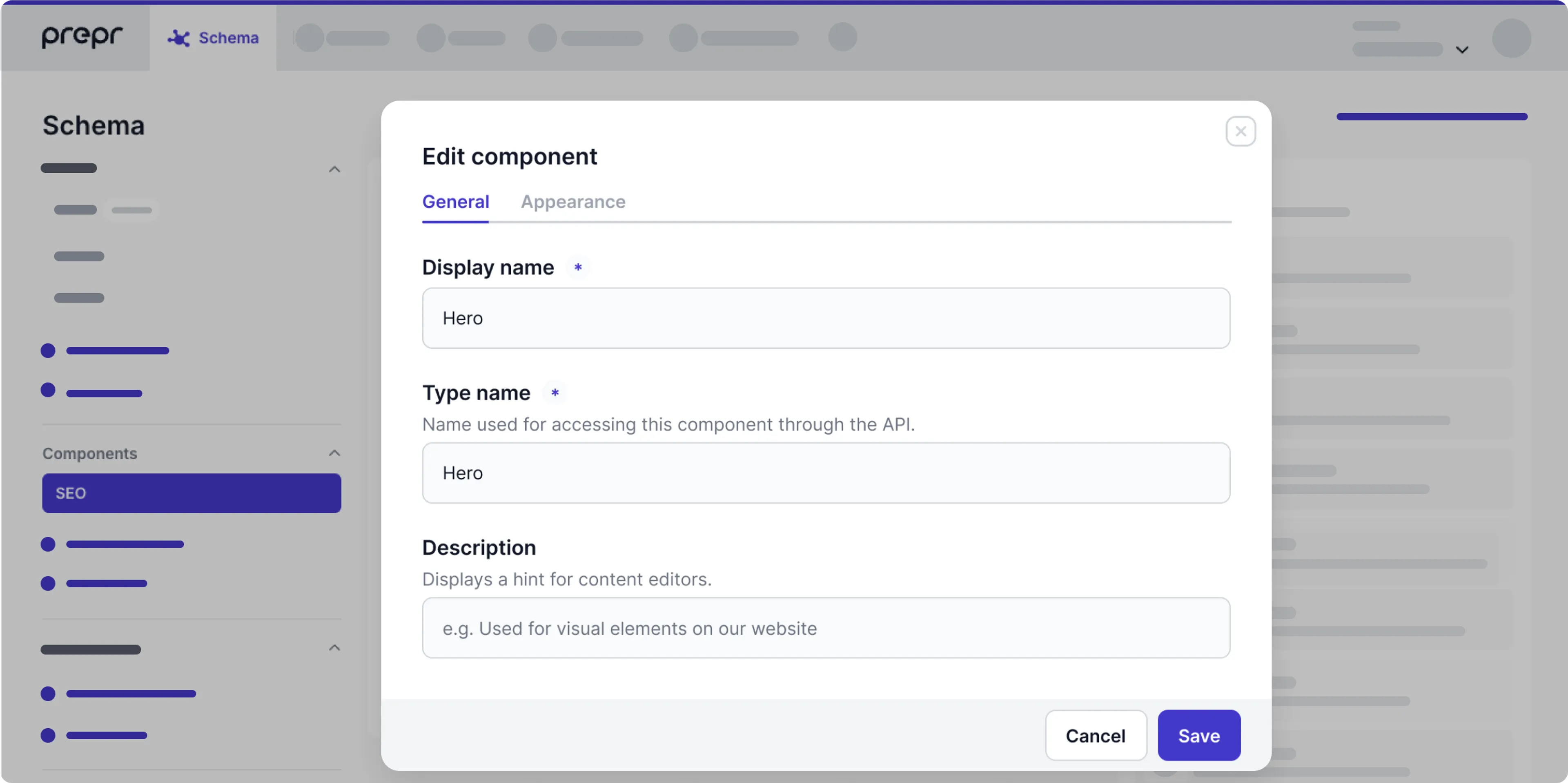
General
The General tab allows you to edit the names and description for the component.
| General fields | Description |
|---|---|
| Display name | A unique name for the component. |
| Type name | This value is important for making requests with the GraphQL API. When you create a new component, this value is auto-generated as follows: PascalCase version of the display name, stripped of all non-alphanumeric characters. For example, the model name News article generates NewsArticle. |
| Description | A description to help editors manage content by showing the purpose of this model. |
Appearance
Click the Appearance tab to upload a preview Image or to set a Tag for the component.
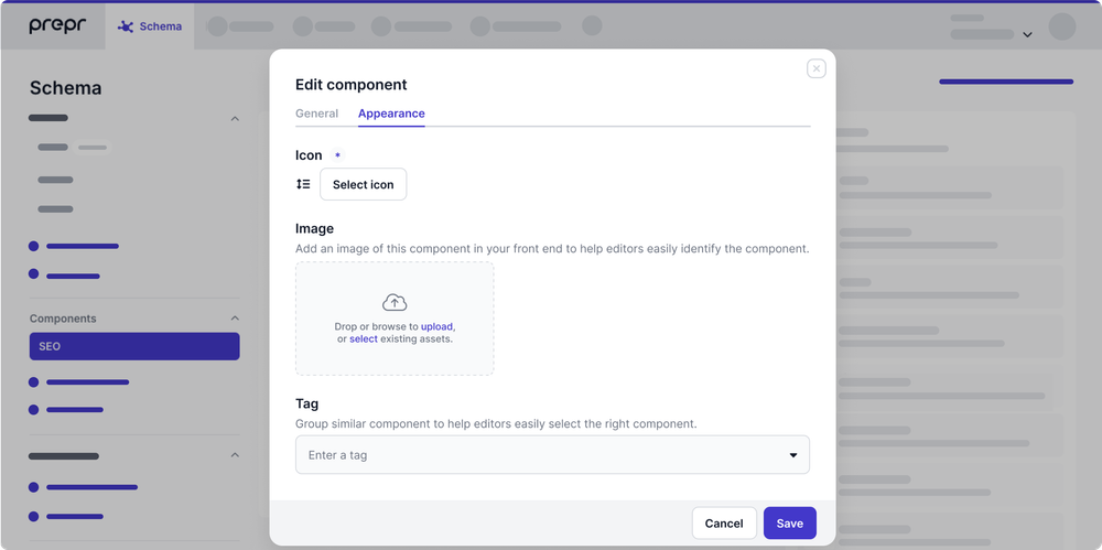
These settings help editors identify the component more easily in stack or reference fields. The preview image helps the editor visualize the content, while the tag puts the component into a logical group.
If you don't upload any preview images for components, content editors will see the corresponding component icon in the selector.
Add fields to a component
To add fields to your component, follow these steps:
- Click the Schema tab to open the Schema Editor.
- Click on the component from the list of models on the left.
- Drag and drop the desired field type, for example, Text,
For a complete list and all the specs, check out all Prepr field types.
Let's look at some basic settings that are common across all field types.
- Using Text as an example, name it as follows:
| General fields | Description |
|---|---|
| Display name | The field label shown in the content editing interface. |
| ID | The value of this field is automatically generated. The technical ID of this field that is used, for example, to retrieve content through the API. |
For more details on the other Text settings, check out the Text field type.
- Click the Appearance tab to set the appearance options for the field.
| Appearance fields | Description |
|---|---|
| Help text | An instruction to help content editors. Make instructions clearer by making text bold, italic, or bolditalic. Use the following standard Markdown syntax: *. and _ (italic) ** and __ (bold) *** and ___ (bolditalic). |
| Show in preview (deprecated) | Enable this option to make the field visible in the preview , which can be accessed using the Preview button in the sidebar of the content item editing interface. Note: From April 24th, 2023, the Preview button is no longer available for new Prepr accounts created after this date. To review your content before publishing, please set up a review URL on a model. Learn more |
| Disable editing | Activate this option if you don't want a content editor to edit this field. For example, when this field is only supposed to be edited through an API request. |
- Click the Validation tab to set up validation rules for the field.
Enable This field is required if this is a mandatory field. The validation only triggers when a content item is set to the Done stage. For more details, check out the Workflow stages doc.
For more details on the other Text validation options, check out the Text field type.
When someone else is editing the same component that you are working on, for example, they change the order of the fields, you will be notified about those changes. In this case, you need to click to apply those changes to your component.
Making changes to fields for a component that is already filled with content could lead to unexpected query results. For example, when you change or delete fields, then the existing content doesn't show up in the query results. Also, when you change existing field names, update your API queries accordingly.
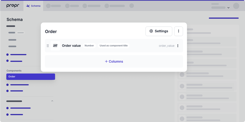
Set a component title
By default, the title of a component in a Stack or Dynamic content field is set to the first Text field in the component or to the value of the Number, Content reference or List field when the component only has one of these fields.
At times, you may want the component title to be the title of a referenced content item. For example, when the embedded component title should be the headline of an article.
Also, a component might just have a List or Number field, and in those cases, you might want the component title to be the chosen list item value or the number entered. For example, a number of the item that defines its order in a list.
To set a Text, Content reference, Number or List field value as the component title, click the icon in the field and choose the Set as title option.
Delete a component
To delete a component, follow these steps:
- Click the Schema tab to open the Schema Editor.
- Click the component from the list of components on the left.
- Click the button at the top of the component.
- Click Delete.
If the component is used in any content items, you will get an error message when you click the Delete link.
Adding columns
You can also use columns to determine the display of the fields in your content item. Columns are used to divide fixed content item fields into a maximum of three columns.
To add columns, follow these steps:
- Click the Schema tab to open the Schema Editor.
- Click on the component from the list of components on the left.
- Click the + Columns button.
- Drag the column element above the fields that you want divided into columns.
- Choose the number of columns that you want those fields to be grouped into.
Exceptions
- A dynamic content editor field and a stack field will always be visible as one-column fields.
- Screen resolutions smaller than 1024 restricts fields to one column.
Create a nested component
Nested components can be added to models directly, to a Dynamic content field or to a Stack field.
Deeply nested components
Take care when nesting components too deeply. A content editor cannot add content for deeply nested components. When they see the message below, it means the maximum level of nesting is exceeded.

Check out the content modeling best practices for more info.
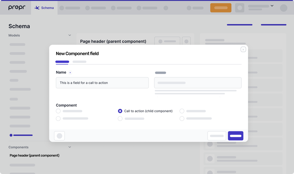
This feature allows you to add an individual (child) component into another (parent) component, creating nested levels of content. You can reuse individual components as many times as needed, even if they're already used within nested components. For example, you can use a call-to-action component in both a page header component and a product collection component.
To create a nested component, follow these steps:
-
Create individual components which represent different elements in your page layout, such as header, image and text, call-to-action, product or article collections, etc.
-
Determine a parent component – the one you’ll be using as a container for other components (child components). Click to open its configuration.
-
From the parent component page, add a new component field and select the needed child component. Save your choice.
Now that you have created the nested component, you can add it to a model directly or place it within a Stack field.
Organize components into folders
When you have dozens of components, folders make it easy to find related components. For example, when you have multiple components which are used as sections of a page.
Click the Add folder link and enter a name for the new folder. Select the components that you want to include in the new folder. Click the Add folder button.
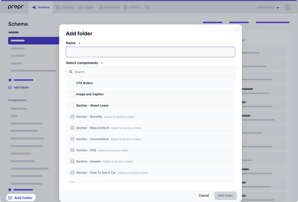
To add or remove components from an existing folder, click the button next to the folder name and select Edit. You can then select or deselect the components that you want to add or remove.
You can also delete the folder by selecting Delete. The folder structure will be removed and the included components will return to the alphabetical list of components.
Export and import a component
Use the export and import if you only need a couple of components copied from one environment to another. For example, export a component from your staging environment and import the component into your production environment.
To sync a schema with models, components, enumerations and remote sources from another environment then follow the process detailed in the Sync schema doc instead.
To share the same components across multiple environments, for example when an organization has different brands, but needs content in separate environments, you can create a shared schema as detailed in the Shared schemas doc.
To export a component, follow these steps:
- Click the Schema tab to open the Schema Editor.
- Click the component that you want to export from the list of components on the left.
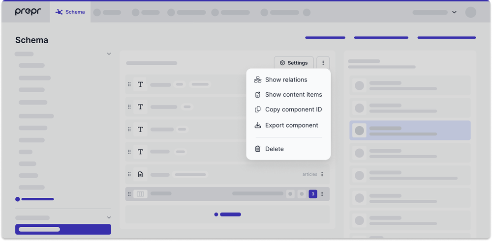
- Click the button at the top of the component.
- Click Export component to download a JSON file of the component.

To import a component, follow these steps:
- Click the Schema tab to open the Schema Editor.
- Then, click the + Add component button.
- Click Or import a component.
- Choose the JSON file of the component that you want to import.
Was this article helpful?
We’d love to learn from your feedback