Page
A page is one of the basic parts of a web app. Check out our demo home page in action.
Introduction
This guide takes you through the content modeling process for a page pattern and explains the reasoning behind the modeling decisions. We’ll look at how to model a feature-rich web page with a variety of elements. Here is a sample web page we used as a basis for the modeling:
Let’s take a closer look at the modeling steps. Using this page as a basis, we see that a number of elements make up the page content. These include:
-
A hero section
The hero section is the prominent part of the page usually at the top. It has a heading, a sub-heading, an image, and one or more buttons. -
A feature section
The feature section showcases important features to highlight and consists of a heading, a sub-heading, button, image and the image position. -
CTA
A call-to-action to encourage interaction from the web visitor. -
Static
Some static sections to showcase more static info like testimonials. -
Cards
Cards are used for things like a selection of blog posts or recommended products. It has a heading, sub-heading, a stack of cards for the items like posts or products. -
FAQ section
A FAQ section to show some common questions and the corresponding answers. -
Contact section
This section gives visitors the opportunity to contact the company.
Let’s look at how to structure a page like this in more detail.
Page model
In our schema, we’ve decided to create a generic Page model that can be used for different kinds of web pages, for example, a home page, marketing pages, landing pages, etc. See an example Page model below:
Within the Page model we define the following fields:
| Field name | Field type | Description |
|---|---|---|
| Title | Text | The title of the page. Required. This title is used internally to identify the page in Prepr. |
| Slug | Slug | Part of the URL that is used to link to this page. The slug can also be used for API queries to request this page and is automatically set to the title of the page in our example. |
| Content | Stack | The main content of the page. Using the Stack field allows editors to add the elements that make up the web page easily, for example, the hero section, a CTA, FAQ section, etc. |
| SEO | Component | SEO is an embedded component which contains fields that are used by search engines and social media. We reuse the same SEO component defined in the Blog pattern doc. |
See a complete list of all other available Prepr field types.
How to model the elements on a page
In our example model above we put the main page content in a Stack field. The Stack field allows content editors to easily create all the elements they need on a page. They can add both components and content items to the stack.
The Stack field contains the following components and models in our Page model:
| Model/component | Type | Description |
|---|---|---|
| Hero | Component | The hero component at the top of the page. |
| Feature | Component | The feature component to allow editors to capture a heading, a sub-heading, button, image and the image position (left or right). |
| CTA | Component | The component for a call-to-action. |
| Cards | Component | The component to show recommendations or posts as cards. The editor can link existing Product or Post content items. Check out the Blog pattern doc for more details. |
| FAQ | Model | A reference to existing reusable question and answer content. |
| Contact | Component | A component to allow editors to include a contact form in the page. |
Let’s look at each element in detail.
Hero
The Hero component is used to include the most prominent part of the page usually at the top.
The Hero component has the following typical fields:
| Field name | Field type | Description |
|---|---|---|
| Heading | Text | The heading usually at the top of the Hero section. |
| Sub Heading | Text | More descriptive text just below the heading. |
| Image | Assets | An asset field that allows editors to include an image in the Hero section. |
| Buttons | Stack | One or more buttons with their respective fields. |
By putting the group of buttons in a stack field, content editors can personalize or A/B test the buttons specifically instead of the whole section where they are included.
Feature
The Feature component in a page can be used to highlight important features.
The Feature component typically has the following fields:
| Field name | Field type | Description |
|---|---|---|
| Heading | Text | The title of the Image and text block. |
| Sub heading | Text | The text content. |
| Button | Component | This component allows editors to label the button and to either link the button to a URL, another page in the website, or to another content item. Maximum of one button or link. |
| Image | Assets | An asset field that allows the editor to attach an image. Maximum of one asset with image asset type. |
| Image position | List | The position of the image in relation to the text, for example, image to the left of the text or to the right of the text. |
CTA
The CTA component can be used to encourage interaction from the web visitor.

The Call to action component typically has at least the following fields:
| Field name | Field type | Description |
|---|---|---|
| Heading | Text | The heading text for this call to action. |
| Sub Heading | Text | More descriptive text for this call to action. |
Static
The Static component can be used to showcase more static info such as testimonials.

The Static component can be made up of at least the following fields:
| Field name | Field type | Description |
|---|---|---|
| Title | Text | The title for this section. |
| Static Type | List | Based on this value, the front end can determine how to display the static content, for example, testimonials or steps. |
Cards
The Cards component can be used to show highlighted blog posts or recommended products.
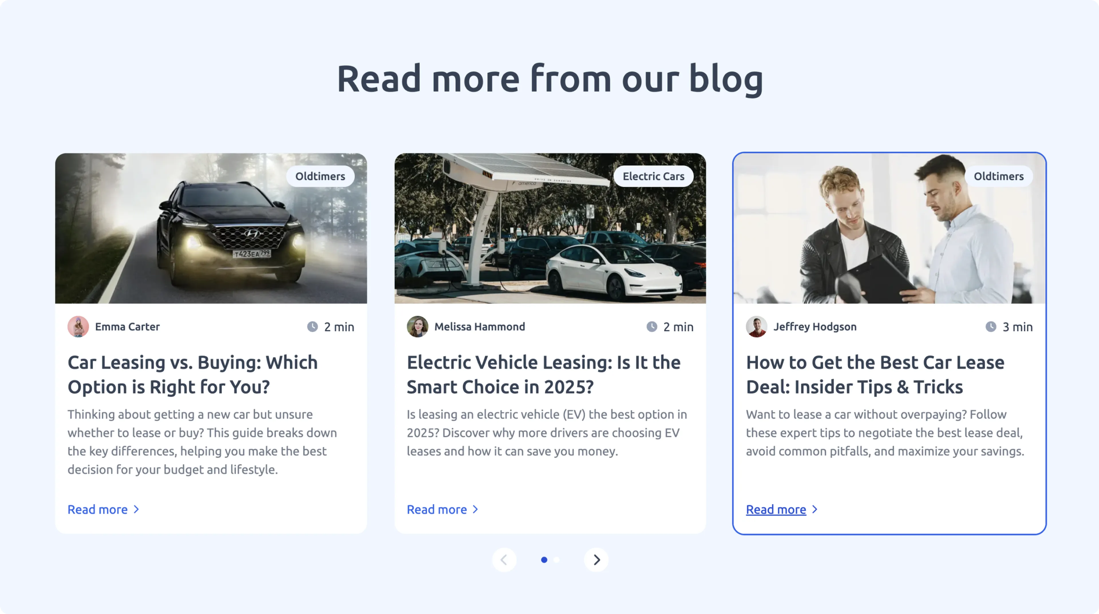
The Cards component is typically made up of the following fields:
| Field name | Field type | Description |
|---|---|---|
| Heading | Text | The heading text for the collection of cards. |
| Sub heading | Text | More description text just below the heading. |
| Cards | Stack | Used to include several posts or product content items. |
| Button | Component | This component allows editors to label the button and to either link the button to a URL, another page in the website, or to another content item. Maximum of one button or link. |
FAQ
The FAQ model is useful to include some common questions and the corresponding answers. By creating a model instead of a component, the content is reusable and the same questions and answers can be referenced in multiple pages.
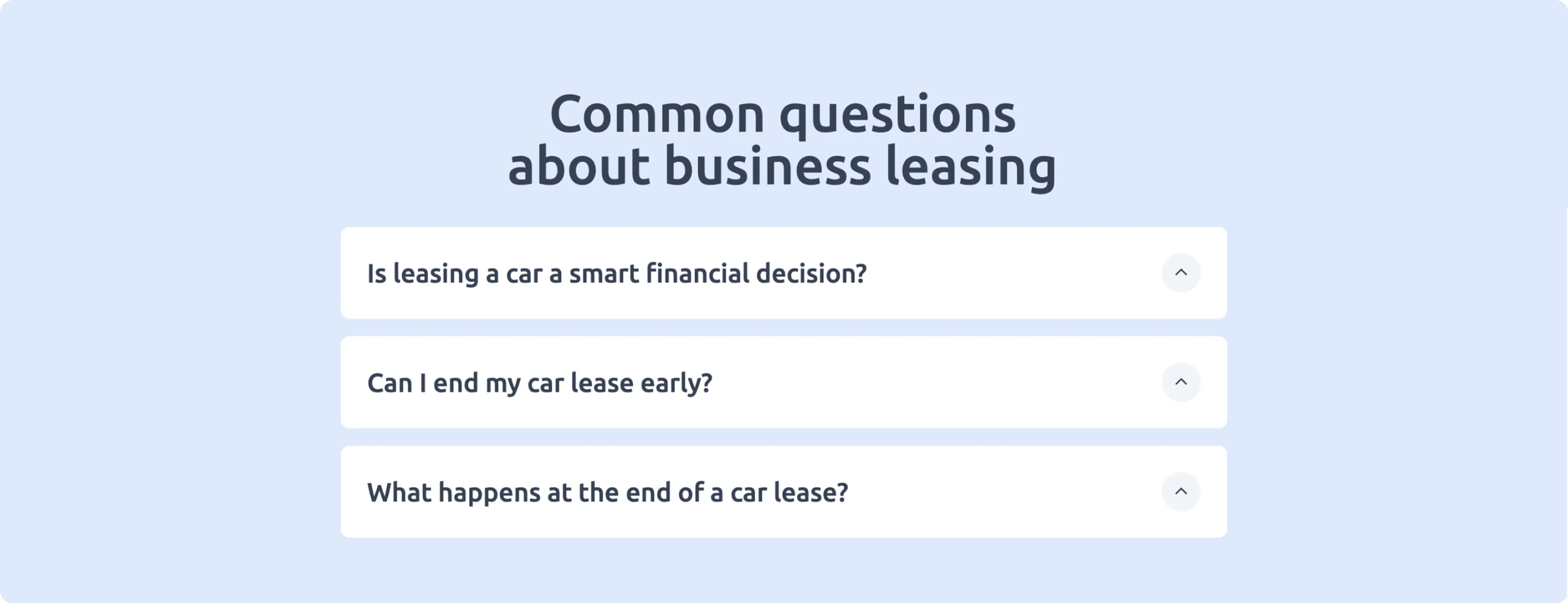
The FAQ model is made up of the following fields:
| Field name | Field type | Description |
|---|---|---|
| Internal Title | Text | The front end uses this field to link to the correct FAQ content item. |
| Title | Text | The title for the section in the page. |
| Questions | Stack | A list of questions and their corresponding answers. |
Contact
The Contact component can be used to give website visitors the opportunity to contact the company.
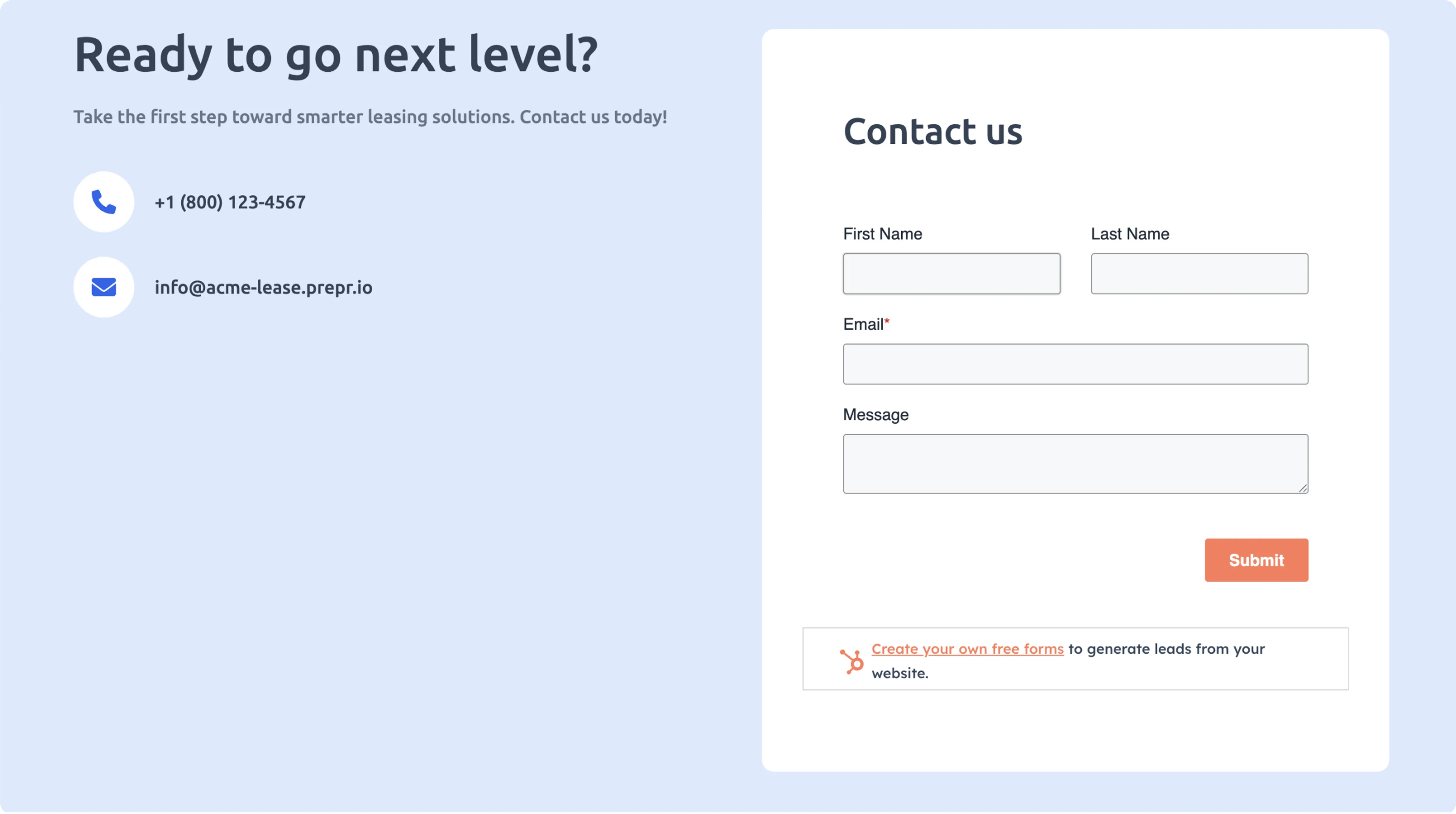
The Contact component is typically made up of the following fields:
| Field name | Field type | Description |
|---|---|---|
| Heading | Text | The heading text for this contact form. |
| Sub heading | Text | More descriptive text just below the heading. |
| Form title | Text | The contact form title. |
| Phone number | Text | Used for your company telephone number. |
| Text | Used to show the company email address. | |
| hubspot_form_id | Text | If you add the HubSpot integration, you can use a matching hubspot_form_id to link to an existing HubSpot contact form. |
| hubspot_portal_id | Text | If you add the HubSpot integration, you can use a matching hubspot_portal_id to link to an existing HubSpot contact form. |
Prepr also has a built-in integration with Typeform which allows you to include forms. For more details, check out the Typeform integration doc.
What’s next?
Now that you know how to model a page, let’s go a step further and look at how to set up personalization doc.
Other use cases
This guide explains how you can design just one example of a page for your web app. This page can be used for several types of pages, for example: home page or landing pages. Feel free to use this structure and amend it to your needs.
Another use case we haven’t covered could be a Job postings page.
In some cases, you may have to access content that is maintained in another system, for example, job postings information. It makes sense that you may want to retrieve the items from the other system to ensure you have up to date information in Prepr. In this example, you can include a job postings element on your page that references the job postings from the external system. Prepr allows you to set up remote content in your model or component which is retrieved from a custom source. Check out how to set up a custom remote source doc for more details.
Want to learn more?
Check out the following guides: