Field types
This article contains a comprehensive list of all the field types available in Prepr.
List of field types
| Fields | Model | Component |
|---|---|---|
| Text For single and multi line text entry. | ✓ | ✓ |
| Assets To add one or more assets (image, video, audio, file). | ✓ | ✓ |
| Stack To create a stack of components and/or models often used for component-based pages. This field is where you enable the A/B testing and personalization features. | ✓ | ✓ |
| Content reference To create a link to another model. | ✓ | ✓ |
| Component To add a custom Component to a model or another component. | ✓ | ✓ |
| Dynamic content An advanced editor for structured elements. | ✓ | ✓ |
| Slug To add part of a URL that describes the path to a specific content item. | ✓ | ✗ |
| Boolean To select one of two possible values (Yes or no, 1 or 0, true or false). | ✓ | ✓ |
| List To select an option from a predefined list. | ✓ | ✓ |
| Number To add an integer or float to your content item. | ✓ | ✓ |
| Remote content To reference content in a remote source. | ✓ | ✓ |
| Form To include forms from an external source like HubSpot or Typeform. | ✓ | ✓ |
| Embed HTML To add an embed to your content item. | ✓ | ✗ |
| Date and time To add a date and time to your content item. | ✓ | ✓ |
| Tags To add a tag entry. | ✓ | ✓ |
| Location To select a location on a map or use coordinates. | ✓ | ✓ |
| Social To add a social media post to your content item. | ✓ | ✓ |
| Color To select a color or use a hex color code. | ✓ | ✓ |
| Help text To provide and highlight additional instructions to editors. | ✓ | ✓ |
Common settings
You can customize how fields appear and behave when editing content items. Here are some field settings that are common across almost all field types.
When you create a new field, you need to enter the Display name. The value you enter is the field label in the content item. The ID value is automatically generated from the Display name value you enter and is useful to retrieve content through the API.
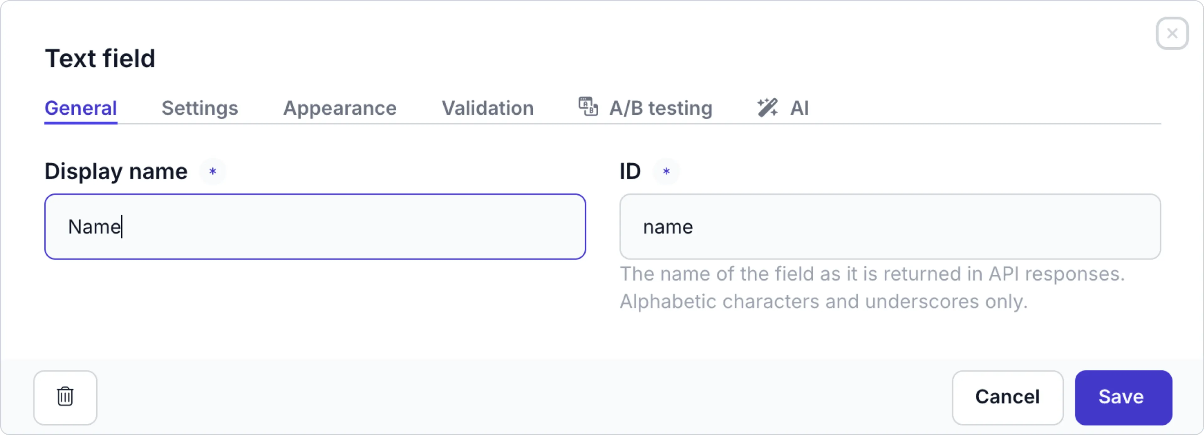
To change the Display name, simply click the field in the model, component, enumeration or remote source to open up the settings. However, the ID value does not change automatically.
Changing the ID impacts API requests, so existing queries relying on this ID will no longer work.
Click the Appearance tab to define Help text, Conditional visibility and the Field display.
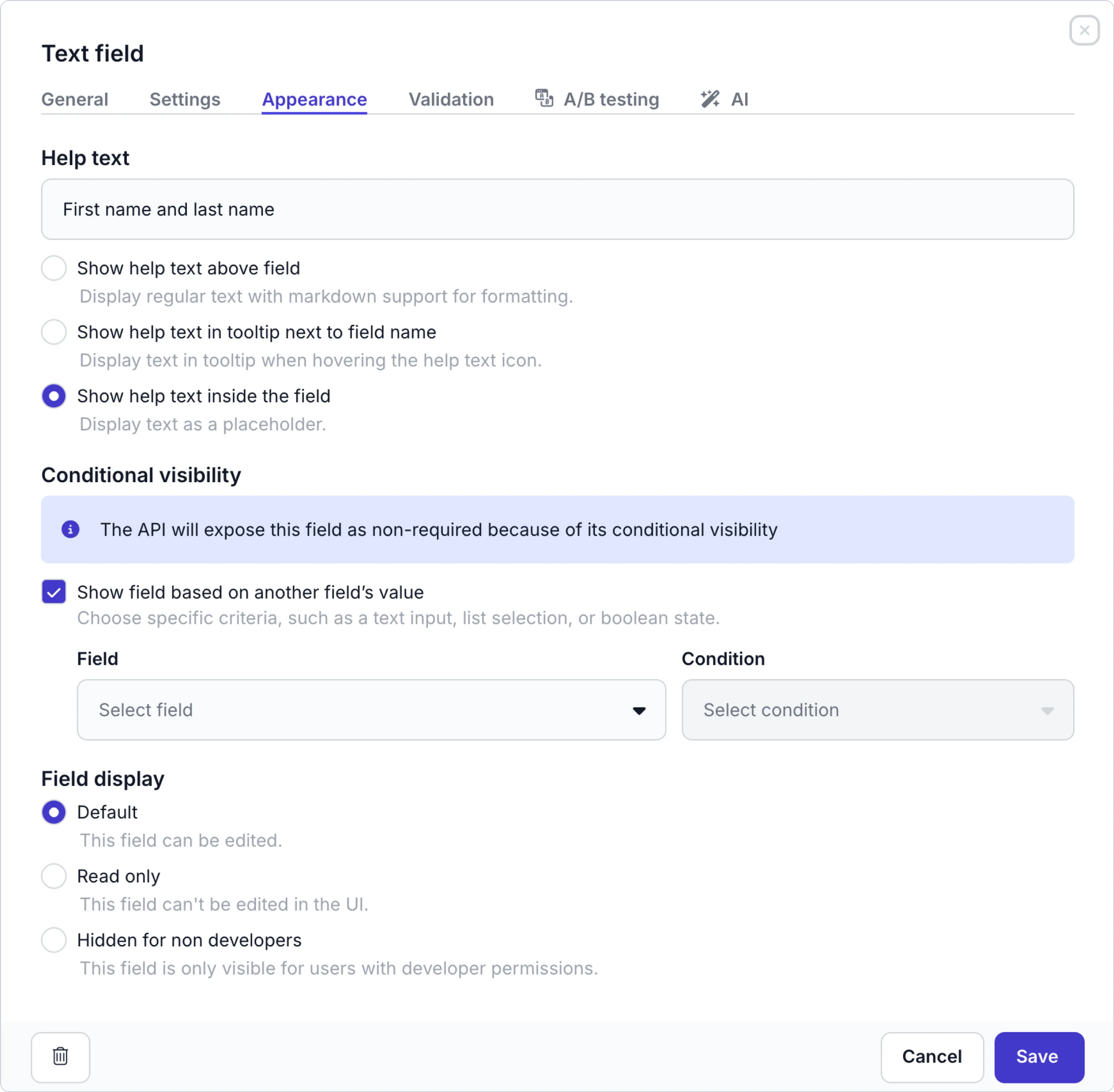
Defining the help text
There are several options to display help text for a field. Enter a clear instruction to help content editors and use bold, italic, or bolditalic to emphasize key words.
You can use some standard Markdown syntax:
*or_for italic**or__for bold***or___for bold and italic.
| Help text option | Description |
|---|---|
| Show help text above field | Choose this option to display the help text just above the field |
| Show help text in tooltip next to field name | Choose this option to display a tooltip next to the field name, a content editor can see when they hover over the icon |
| Show help text inside the field | Choose this option to display the help text directly in the field box as a placeholder value. |
Setting up conditional visibility
Enable the Show field based on another field’s value if you want to make this field visible in the content item depending on the value of another field. You can add the following types of conditions depending on the field type:
| Field type | Available conditions |
|---|---|
| All | For any field type you can check if another field in the model or component is not empty or empty. |
| Boolean | You can choose to match one of the boolean values. |
| List | You can choose to match one or more values in the list, for example: Show Model year when the Product type is Car. |
| Text | You can choose to match by regex pattern, for example: Show Subject field if field is an email address. |
If a conditionally visible field is required, you can set up the environment to ignore the required validation when the field is hidden. Check out the environment settings for more details.
Defining the field display
The Field display options let you choose to keep a field editable, or make it read-only or only visible to developers.
| Display option | Description |
|---|---|
| Default | The default UI setting. This option allows the field to be edited by any user in the UI. |
| Read only | Disables the field in the UI and it can only be edited through the API. |
| Hidden for non developers | The field is only visible in the UI for users with developer permissions. |
Validation rules
Click the Validation tab to see the validation rules for the field.
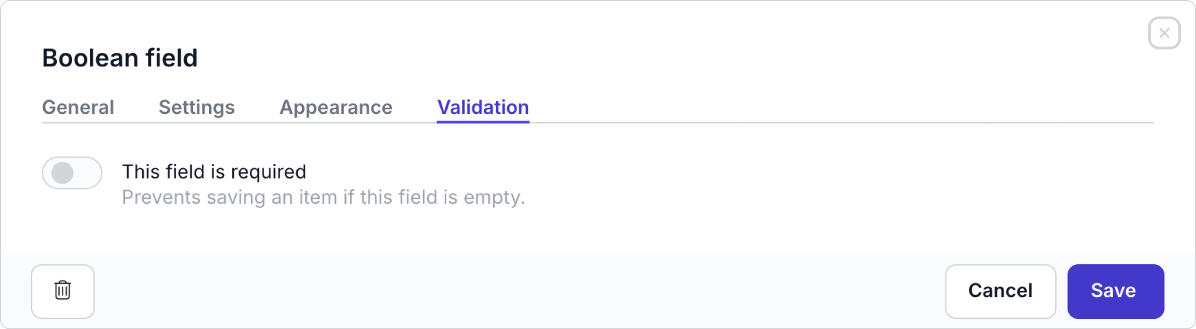
Enable This field is required if this is a mandatory field. The validation only triggers when a content item is set to the Required field validation stage defined in the environment settings, usually the Done workflow stage. For more details, check out the Workflow stages doc.
If the required field is hidden based on the Conditional visibility setup, you can set up the environment to ignore the required validation. Check out the environment settings for more details.
Text field
The text field allows content editors to add single and multi-line text elements to your content item.
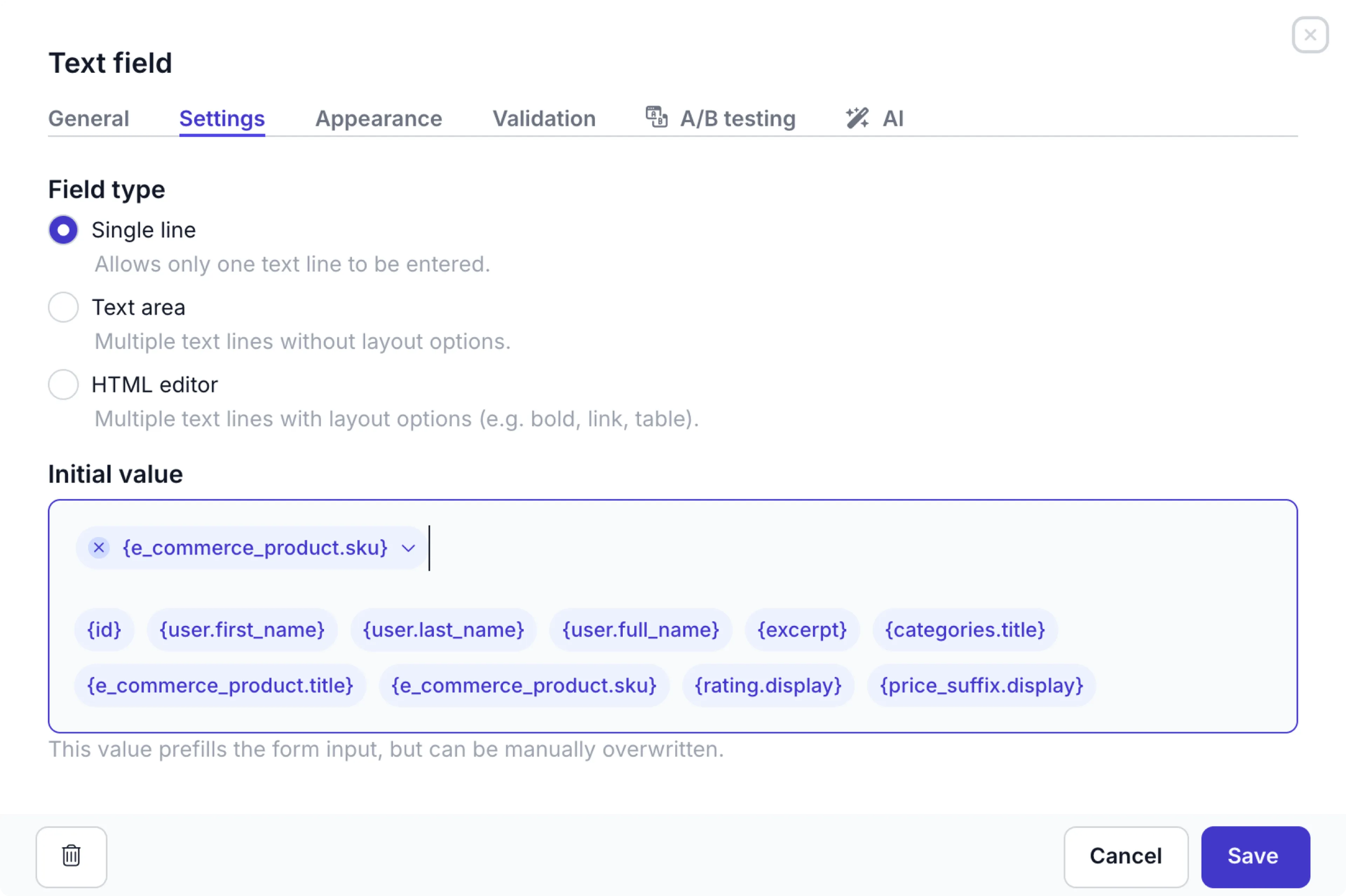
Click the Settings tab to fill in the following settings:
| Settings | Description |
|---|---|
| Single line | Allows only one text line to be entered |
| Text area | Multiple text lines without layout options |
| HTML editor | Multiple text lines with layout options, like heading, bold, italic, underlined, list, dynamic and external links, table, and alignment. |
| Initial value | You can enter a fixed value or choose a field to prefill this value automatically when a content editor creates the content item. The value can be overwritten manually. For a dynamic initial value, simply click the corresponding API name from the list of fields in the info box. The list of fields includes the system fields id, user.full_name, user.first_name, user.last_name and any other Text field, Content reference field, like categories.title, List field or a Remote source field, like shopify.id. |
For text fields in components, you can add fields from any model to the Initial value by typing {@ and choosing the relevant field.
For example: To prefill SEO meta description from the Post excerpt field value, you can select {@Post.excerpt}.
If you choose the HTML editor text field, then you can also enable/disable Heading options in the settings:
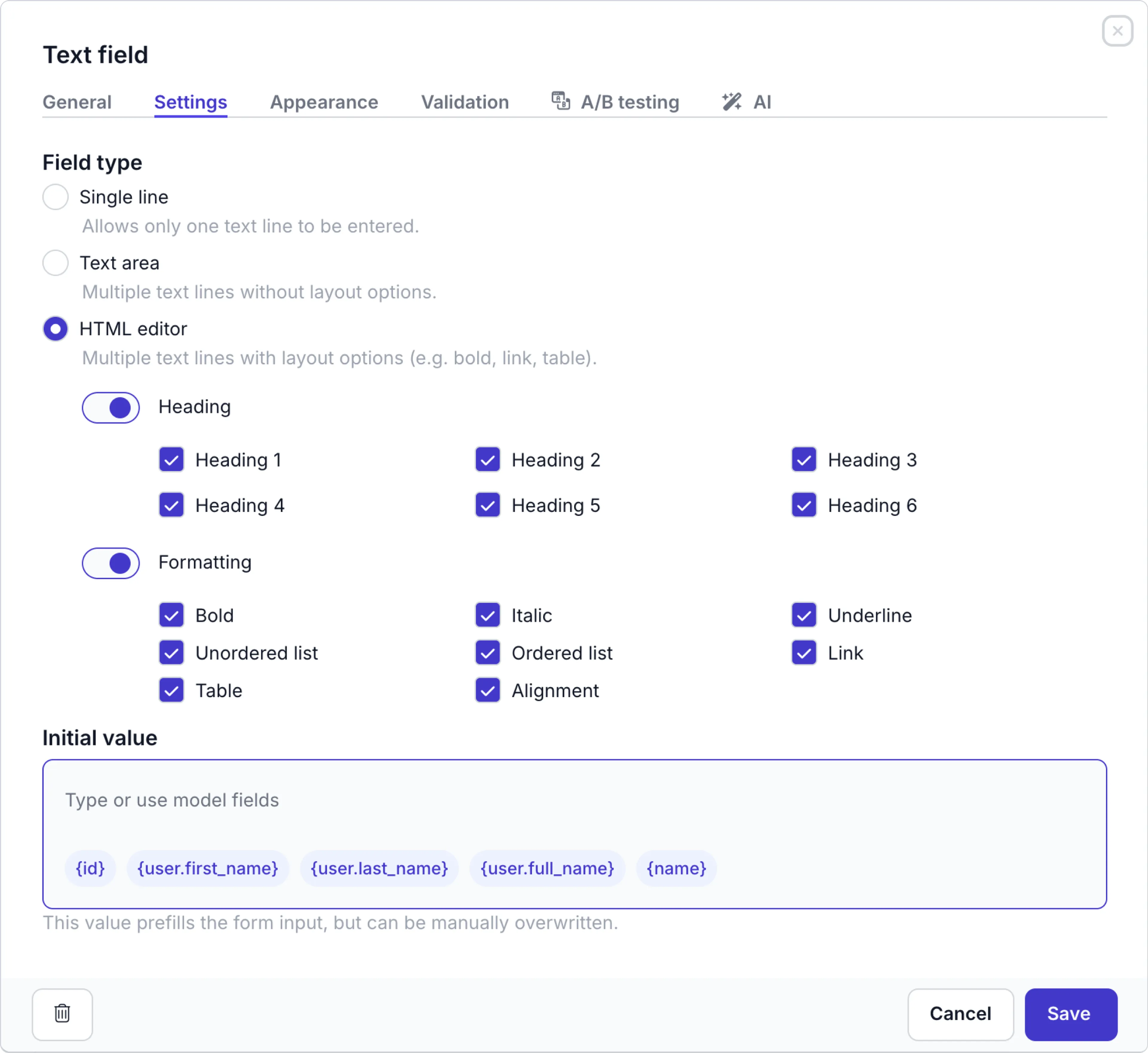
Enable the Heading option to allow headings and choose which of the headings (1 - 6) will be available to content editors.
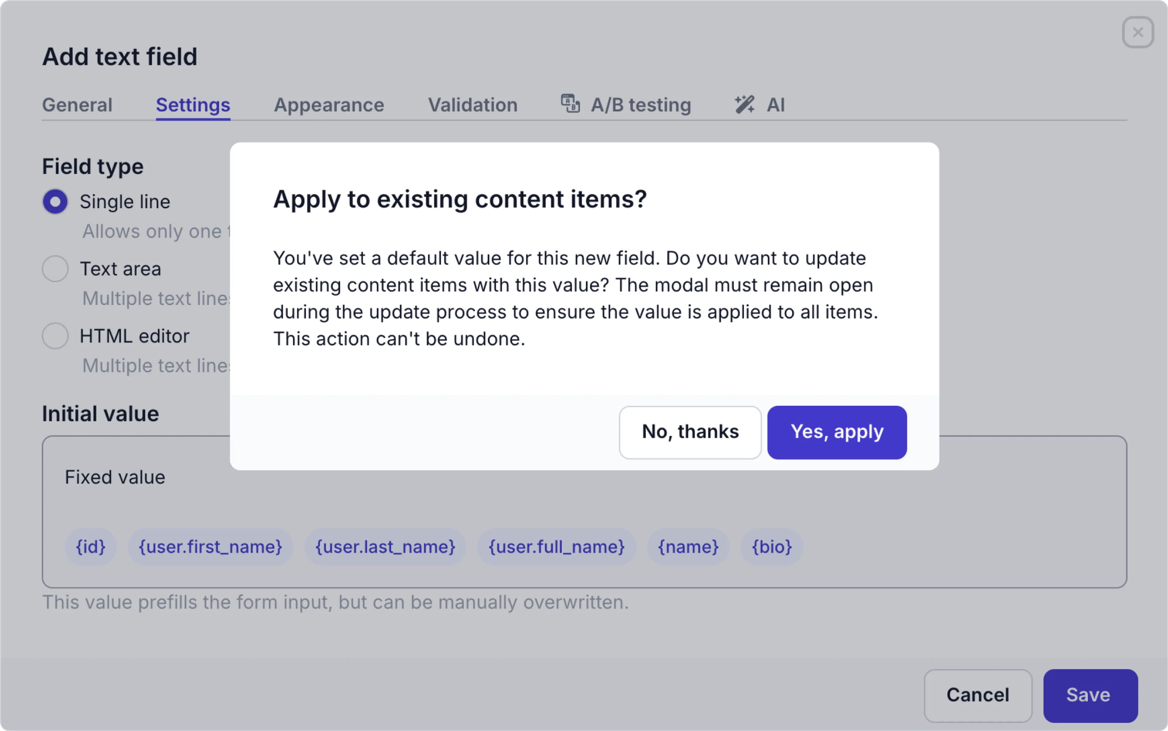
When you create a new Text field and enter a fixed Initial value (instead of choosing a dynamic value from the list) and content items already exist for the model, a confirmation modal appears. Click the Yes, apply, button in the modal to automatically update all linked content items with this value.
For details on Appearance options, check out the basic field settings.
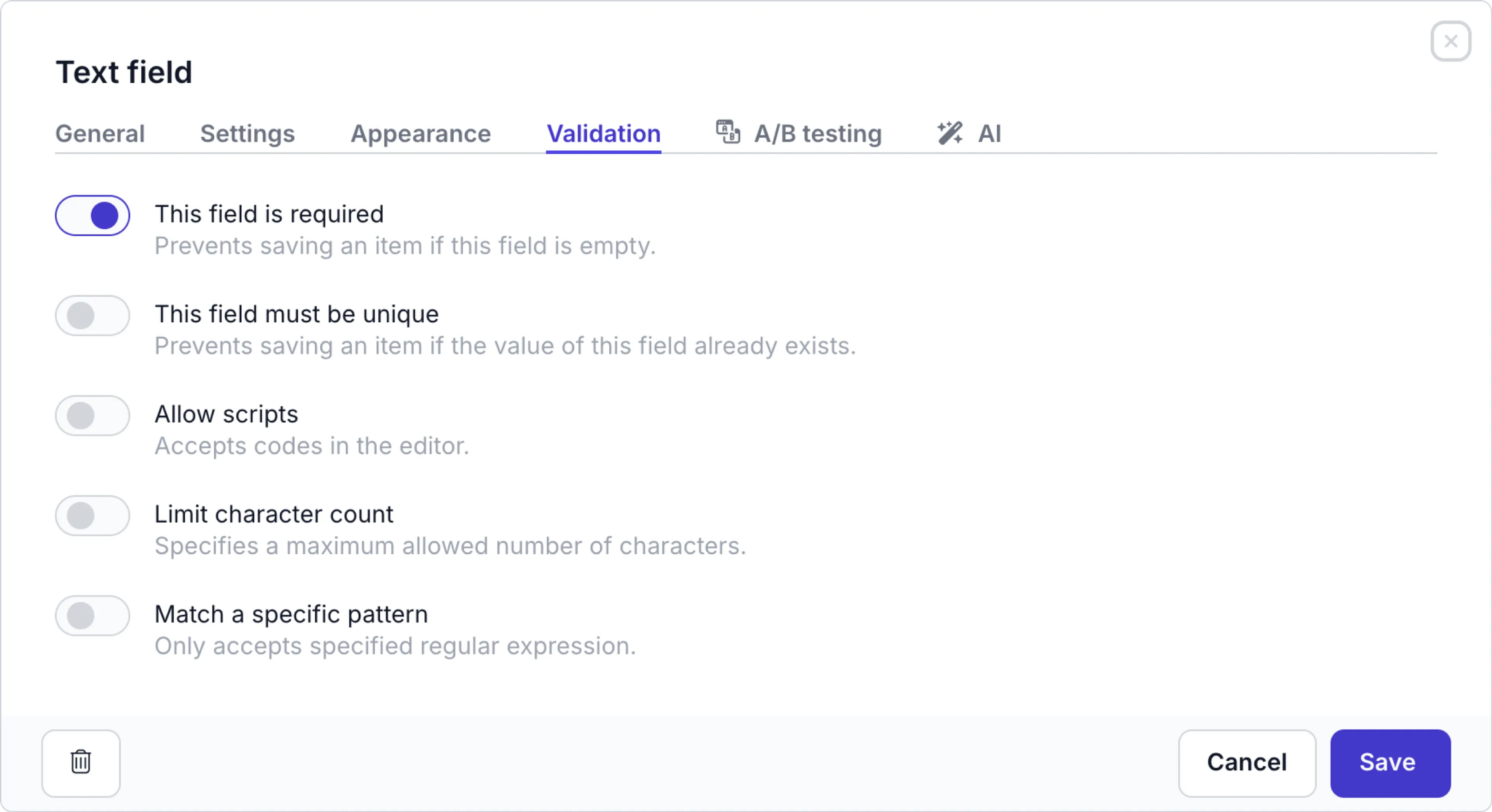
Click the Validation tab to set up validation rules:
| Validation | Description |
|---|---|
| This field is required | Prevents saving a content item if this field is empty |
| This field must be unique | Prevents saving a content item if this field value already exists for this field in another content item. This validation can only be enabled for a Single line type for a text field. |
| Allow scripts | Make it possible to copy-paste or add (HTML-)code in a content item |
| Limit character count | Specifies a maximum allowed number of characters. This option is useful, for example in titles when your website or app accepts a limited number of characters |
| Match a specific pattern | Only accepts specified regular expression (regex). Validates that the value of a field matches a specific pattern defined by a regular expression. |
For your convenience, you can choose from a number of common predefined regex rules:
-
Email: An email consists of a user name, followed by ‘@’ followed by a domain name. Characters allowed in a user name are alphanumeric characters (a-z, 0-9), ‘_’, ‘.’, ‘-’.
-
URL: A valid URL requires a protocol prefix (http, https) and a top-level domain, like
-
domain.com -
www.domain.com -
http://domain.com -
https://domain.com -
https://www.domain.com
-
-
Date (European): Dates in the format ‘DD/MM/YYYY’. Single-digit months and days may or may not have a leading zero. You can use / and - and . as digit-dividers:
-
d.m.yyyy
-
dd.mm.yyyy
-
d/m/yyyy
-
dd/mm/yyyy
-
d-m-yyyy
-
dd-mm-yyyy
-
-
Date (US): Dates in the format:
-
m.d.yyyy
-
mm.dd.yyyy
-
m/d/yyyy
-
mm/dd/yyyy
-
m-d-yyyy
-
mm-dd-yyyy
-
-
12h Time: Accepts time values in the HH:MM:SS AM/PM format. Allowed hours are from 01 to 12, columns are required, while the use of seconds is optional. The input must contain AM/PM notation in either lower- or upper-case:
-
hh:mm AM
-
hh:mm:ss AM
-
hh:mm PM
-
hh:mm:ss PM
-
-
24h Time: Accepts time values with format HH:MM:SS. Allowed hours are from 01 to 24. The input cannot contain AM/PM notation:
-
hh:mm
-
hh:mm:ss
-
Please note that predefined regex rules don’t work on HTML editor text fields. To make a regex work on a HTML editor, you need to add a custom regex, like ^(?:<(.*)>car(?:<\/\g{1}))$ (instead of ^car).
Item title and SEO fields
By default, the first text element in your model or component is used as a title. This label is used to display the item in lists. You can manually change the title to another text element by clicking the icon and choosing the Set as title action for that field. You can also mark a field as an SEO title or Meta description.

The text field labels in the model overwrite the text field labels in a component used in the same content item.
For example: If the title in a Page is set as the SEO title and the page content item includes a Header component with a text field that is also set as an SEO title, then the model text field will be used as the SEO title for the page content item.
When you set the SEO title and the Meta description correctly, editors get useful SEO suggestions when they run the Content check feature.
For the AI setup check out the Text AI assistant guide.
Data privacy Since we are using the OpenAI API, data will be stored for 30 days (by default, for violation checks), but will not be used for AI training purposes.
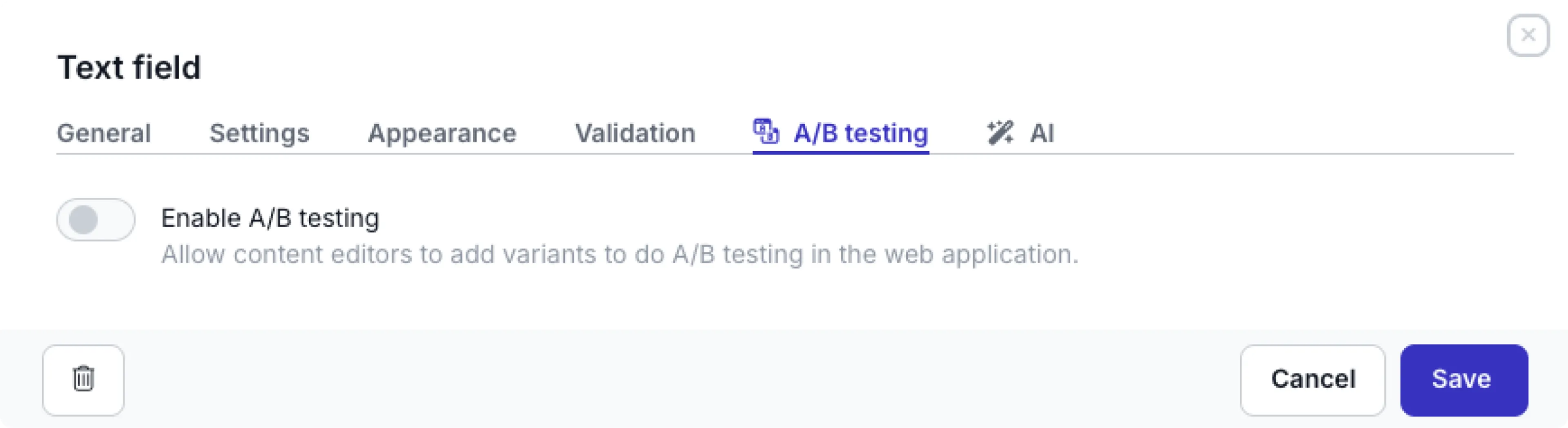
A/B testing
Click the A/B testing tab to enable or disable the A/B testing. When it’s enabled, you allow content editors to add A/B testing variants to a text field.
Assets field
Prepr supports multiple asset types: images, files, videos, and audio files. For more details on how to work with assets, check out the Work with assets guide.
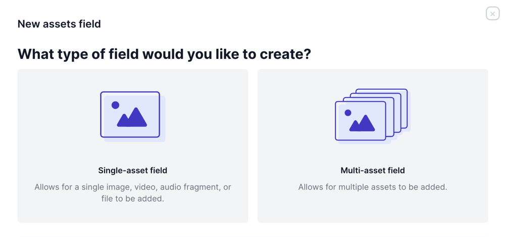
When adding a new assets field to a model/component, you can choose between a Multiple-asset field or a Single-asset field depending on the number of assets you want to add. The chosen type can be changed later in the field configuration.
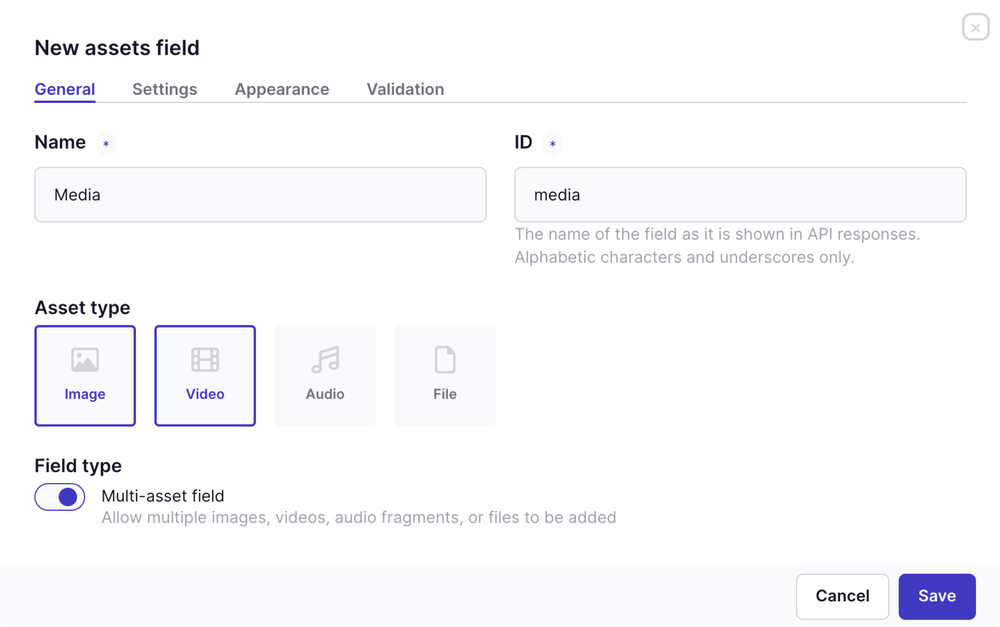
From the General tab, select which Asset type is allowed in this field, such as image, video, audio, or file.
Here, you can also change the Field type you’ve chosen previously, from multi-asset to single-asset, and vice versa.
Assets field settings
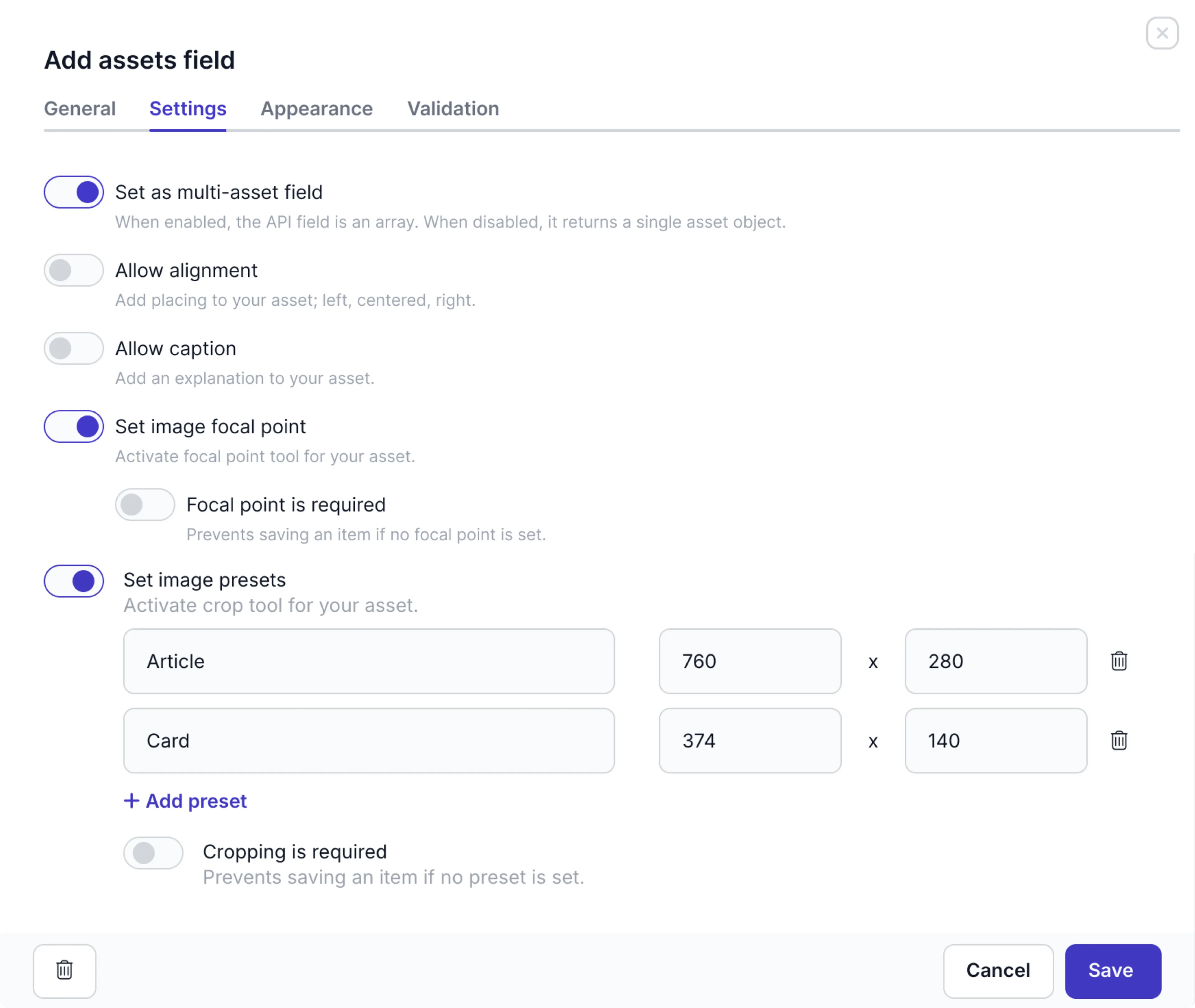
Click the Settings tab to choose the following settings for an Assets field:
Settings | Description |
|---|---|
| Set as multi-asset field | Enabled by default. This option allows content editors to add more than one asset to their content item for this field. Disable this option if you want to restrict the field to one asset only, such as the cover image for a blog post. |
| Allow alignment | Enable this option to allow the content editor to left-, center- or right-align the asset. |
| Allow caption | Enable this option to allow the content editor to provide a caption for the asset. |
| Set image focal point | Enabled by default. This option allows content editors to set a focal point in the image. |
| Focal point is required | This setting is visible when you enable Set image focal point. Enable this option to make it mandatory for the content editor to set an image focal point. |
| Set image presets | Enable this option for content editors to crop images. When enabled, you can define multiple presets for cropping. The Image presets are image size (aspect ratio) templates you can define for different device types or use cases. For example, you may want to define a preset for displaying images on mobile or using them in a banner. Note that crop values are not based on image resolution. |
| Cropping is required | This setting is visible when you enable Set image presets. Enable this option to make it mandatory for the content editor to crop the image. |
When the Set image focal point is enabled, you cannot enable the Set image presets option and vice versa.
For more details on how to resize assets in the API, check out the GraphQL field types doc and the REST API docs.
For more details on how to use the image options, check out Edit and configure assets Edit and configure assets.
Click the Validation tab to indicate if this field is required.
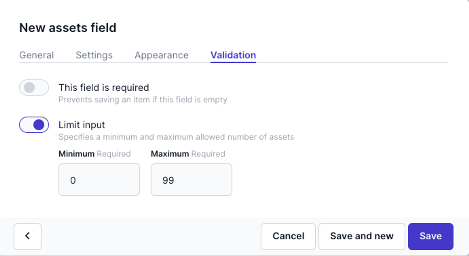
For the multi-asset field type, you can also enable the Limit input option and set a minimum and a maximum number of assets allowed.
Stack field
The Stack field allows content editors to ‘stack’ multiple components and content items within a single field. It also allows them to personalize elements in a stack. Check out the Personalization guide for more details. The stack field is often used to structure the elements for web pages.
When you add a stack field to a model or component, you can choose to create a single stack. For example: if a page content item can only have one header. The chosen type can be changed later in the field configuration.
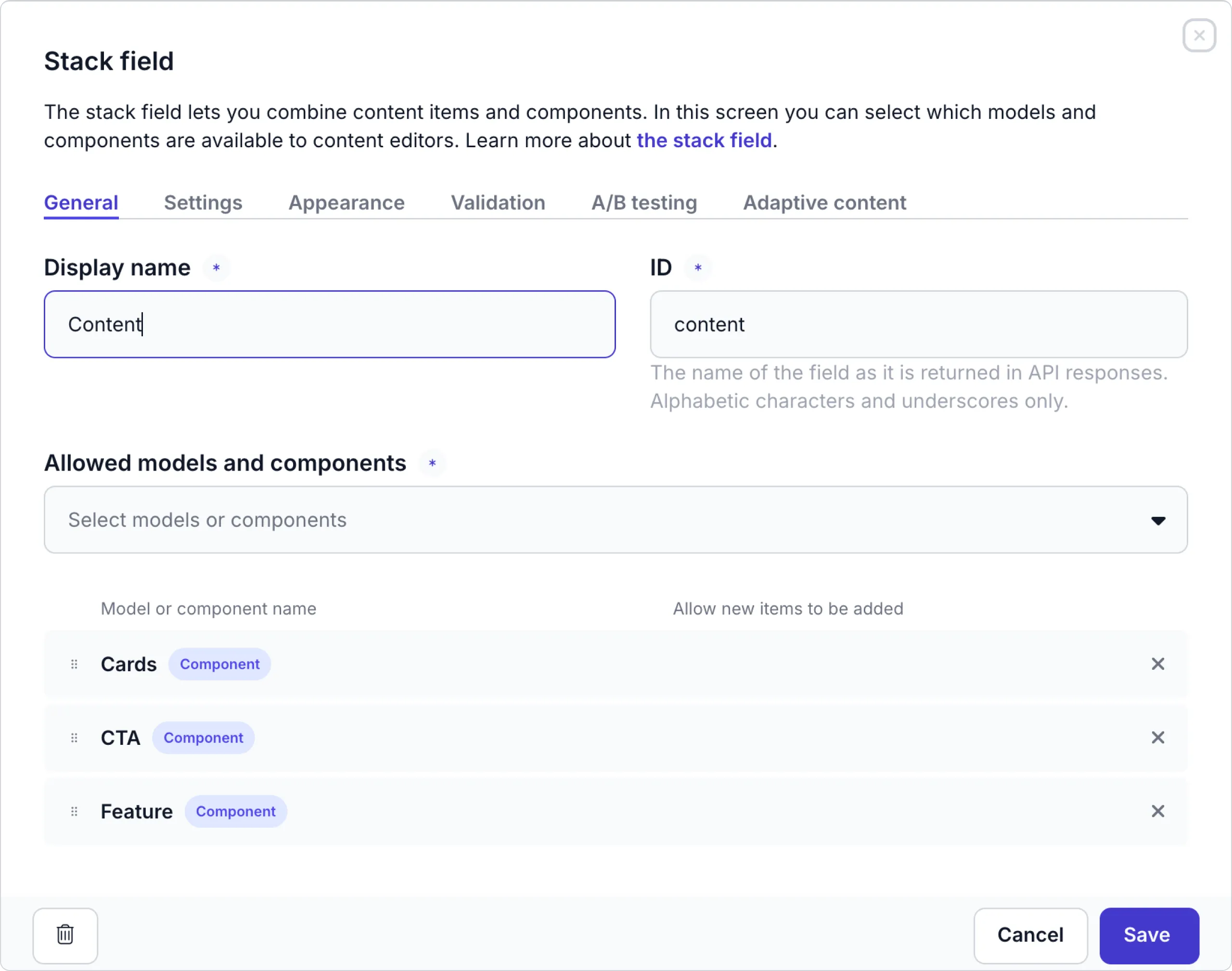
Define the general options as follows:
| General options | Description |
|---|---|
| Allowed models and components | Select all the models and components that the content editor can include in this stack. |
| Allow new items to be created | For each model, disable this option if the content editor should only reference existing items while compiling the stack. |
| Allow items from all environments | For each selected model, enable this option to allow content editors to include content items for this model from other environments within the organization. This allows the content to be shared across an organization. For more details on shared content, check out the Environments doc. |
Click the Settings tab to define the settings below.
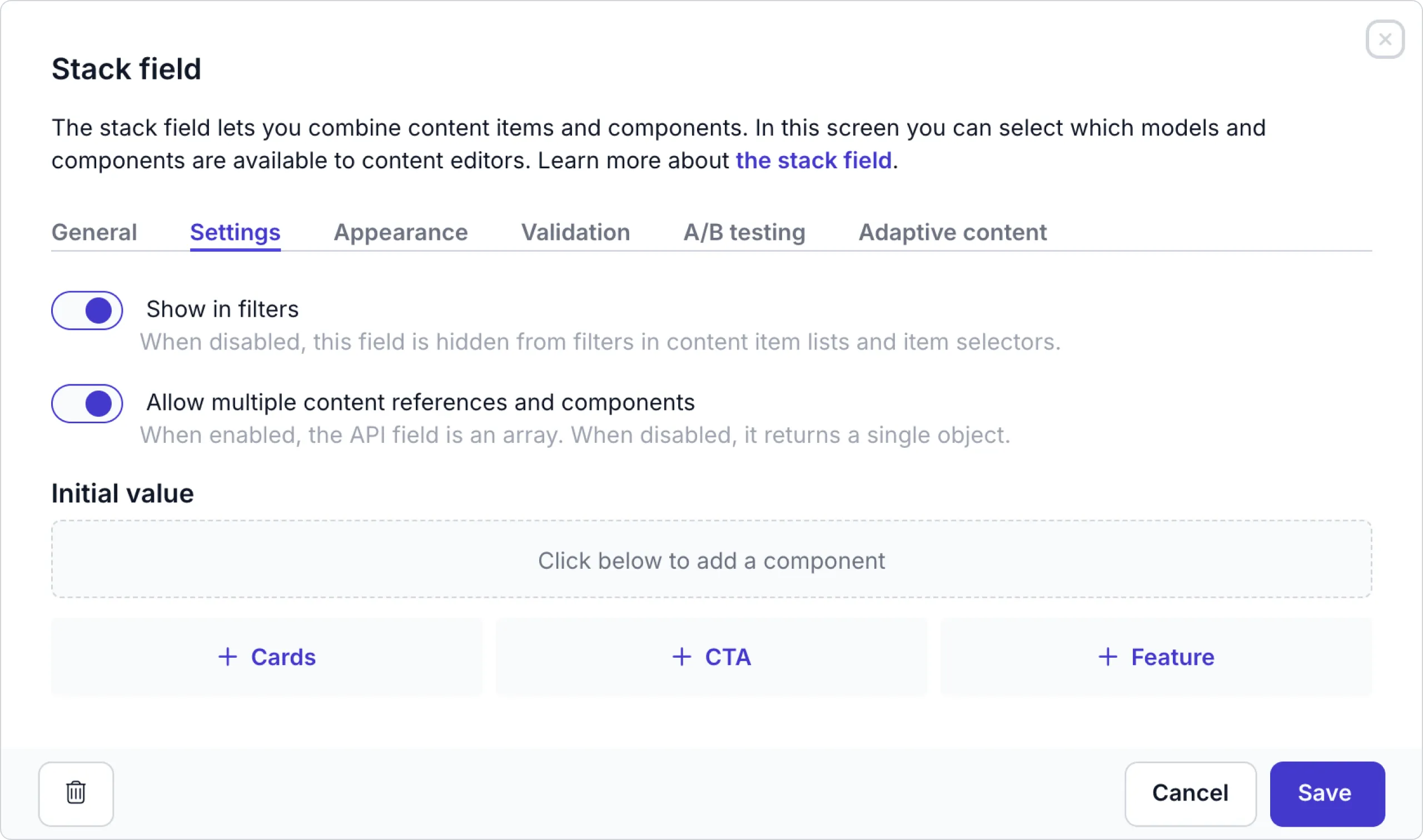
| Settings | Description |
|---|---|
| Show in filters | You can hide this field from the content item filter menus by disabling this setting. |
| Allow multiple content references and components | Disable this option to limit the content editor to adding a single referenced item or a single component in the stack of the model or component. |
| Initial value | You can set an initial value to a list of existing content items and components to help content editors create a content item more quickly. |
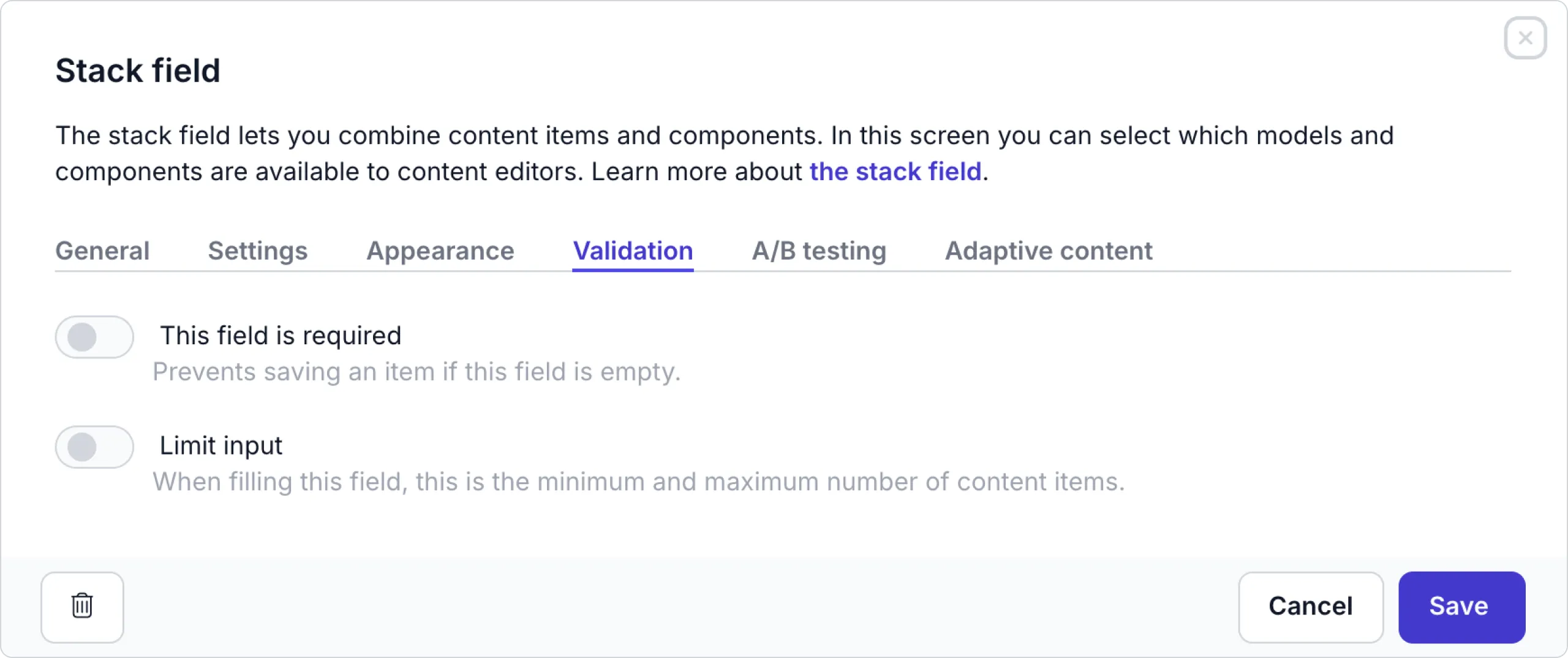
Click the Validation tab to enable the Limit input. Enable this option to set a minimum and maximum allowed number of referenced content items and components.
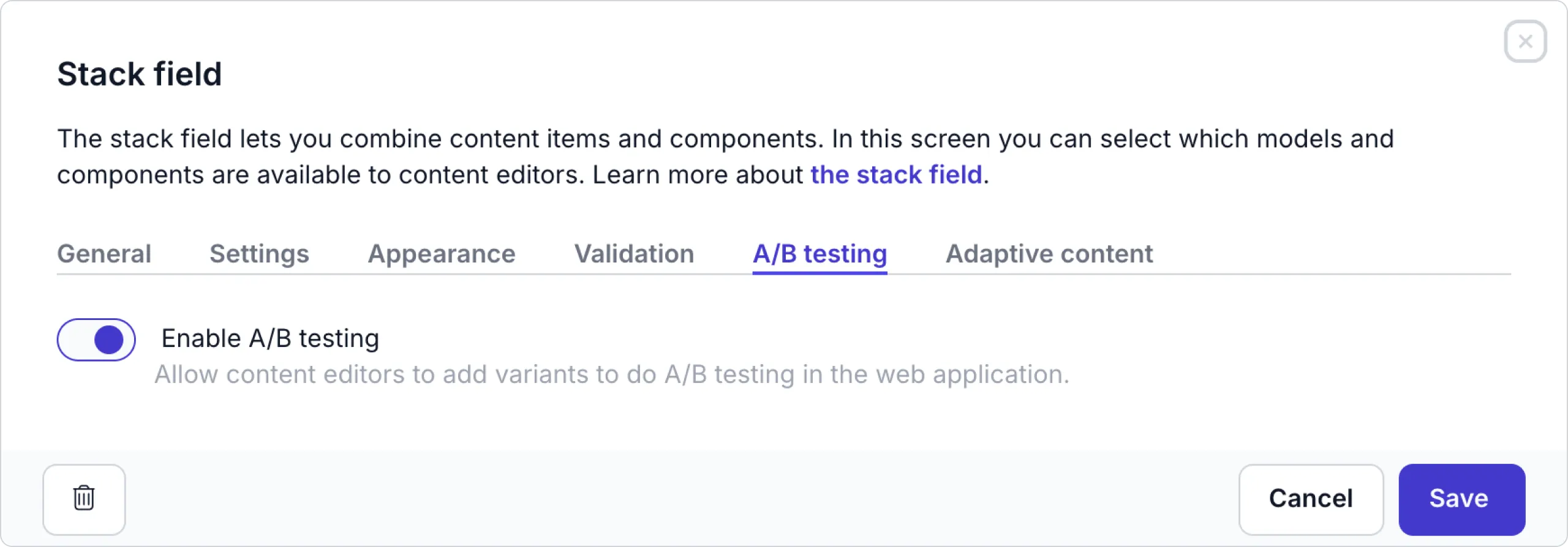
Click the A/B testing tab to enable or disable the A/B testing. If you disable it, this feature will not be available to content editors to add A/B testing groups to this stack field.
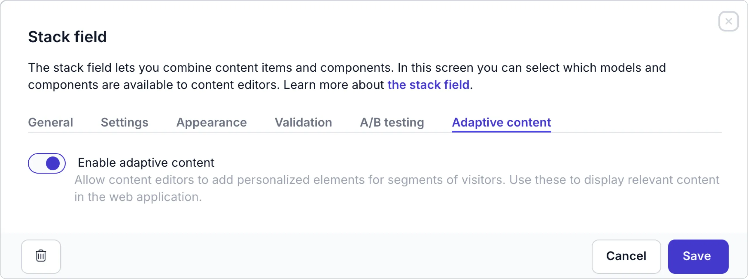
Click the Adaptive content tab to enable or disable the Adaptive content feature. If you disable it, content editors will not be able to personalize elements in this stack field.
Check out the Example Page pattern doc for details on how to use the stack field in your model or component.
Content reference field
The content reference field allows content editors to make a reference link from one content item to another.
When you add a content reference field to a model or component, you can choose to create a single content reference. The chosen type can be changed later in the field configuration.
From the General tab, select the following options:
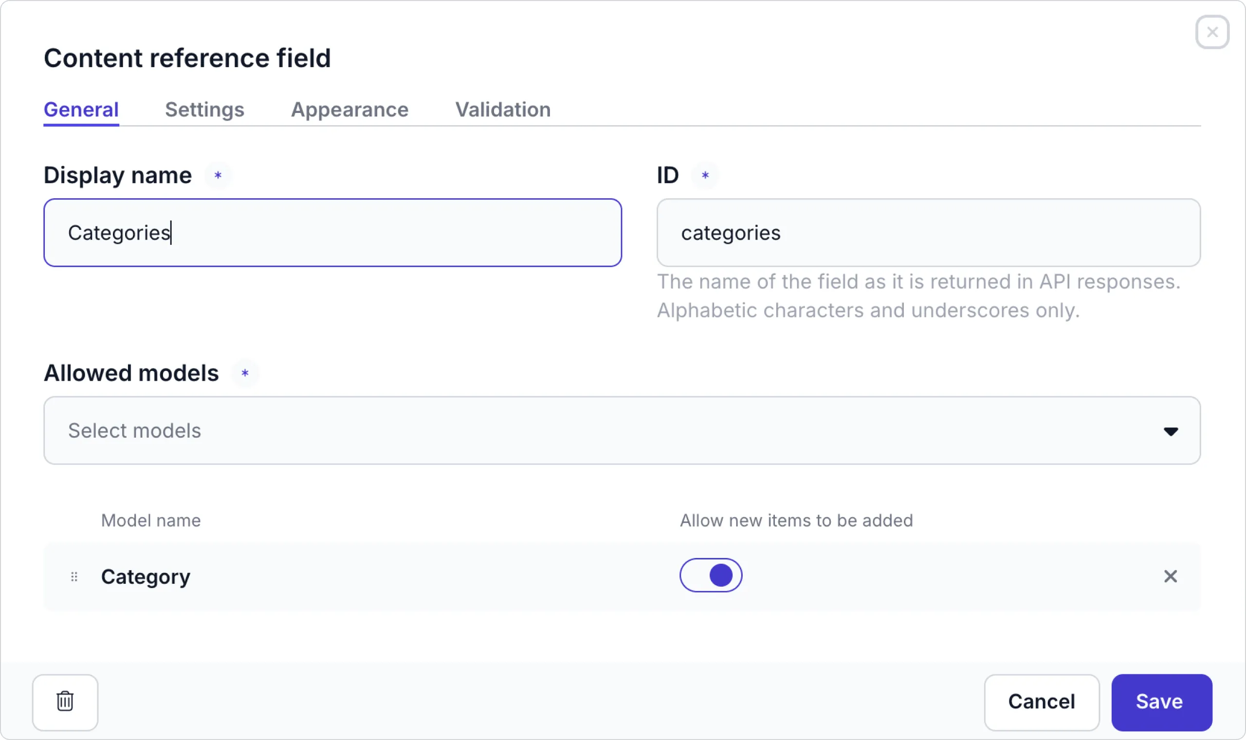
Select the models and complete the general options as follows:
| General options | Description |
|---|---|
| Allowed models | Select all the models that the content editor can use within the content reference field. |
| Allow new items to be created | For each model, disable this option if the content editor should only reference existing items. |
Click the Settings tab to view the following settings:
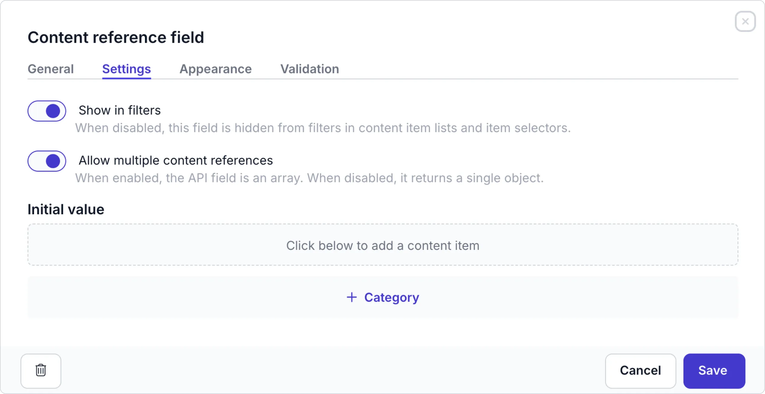
| Settings | Description |
|---|---|
| Show in filters | You can hide this field from the content item filter menus by disabling this setting. |
| Allow multiple content references | Disable this option to limit the content editor to adding a single referenced item to the model or component. |
| Initial value | You can set an initial value to an existing content item that prefills the value when a content editor creates a content item. |
Click the Appearance tab to set the type that determines how the field is displayed on the content item.
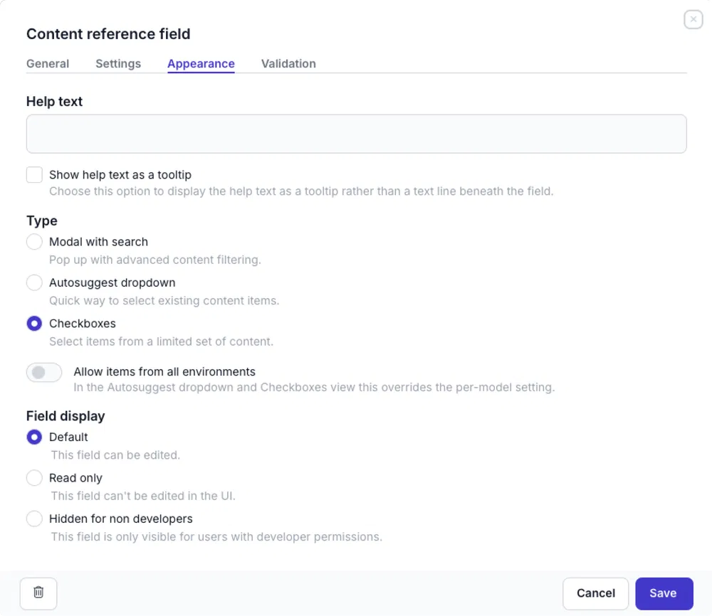
Choose to show a link field as a Modal with search, an Autosuggest dropdown, or as Checkboxes.
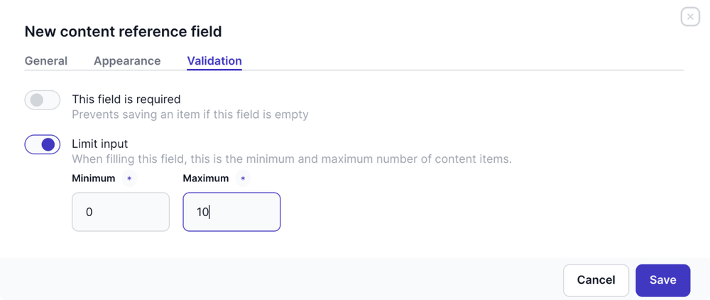
Click the Validation tab to enable the Limit input. Enable this option to set a minimum and maximum allowed number of referenced content items.
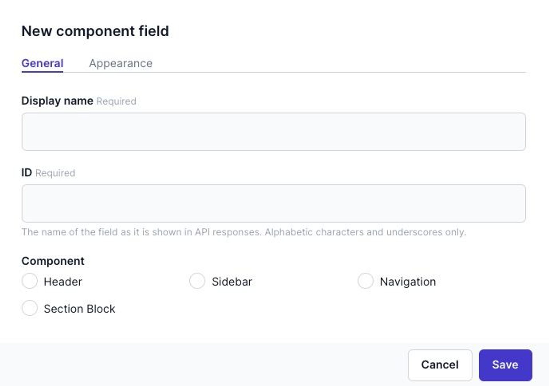
Component field
The Component field allows content editors to include the predefined fields from a previously created component.
From the General tab, choose the component that you want this model to use.
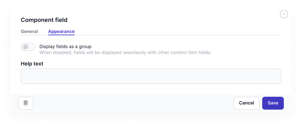
Go to the Appearance tab, to choose the display options.
| Appearance options | Description |
|---|---|
| Display fields as a group | Enabled by default to display the component fields in a group with a title separated from other fields in the content item. When this toggle is disabled, component fields are displayed like any other content item field. |
Dynamic content field
The dynamic content field allows content editors to combine various elements. Those elements can include text, headings, lists and even components.
The dynamic content field is commonly used to create articles with a variety of content and different styling for each element.
This field offers different elements, with variable options that you can manage in the model:
Click the Content types tab to enable the following elements:
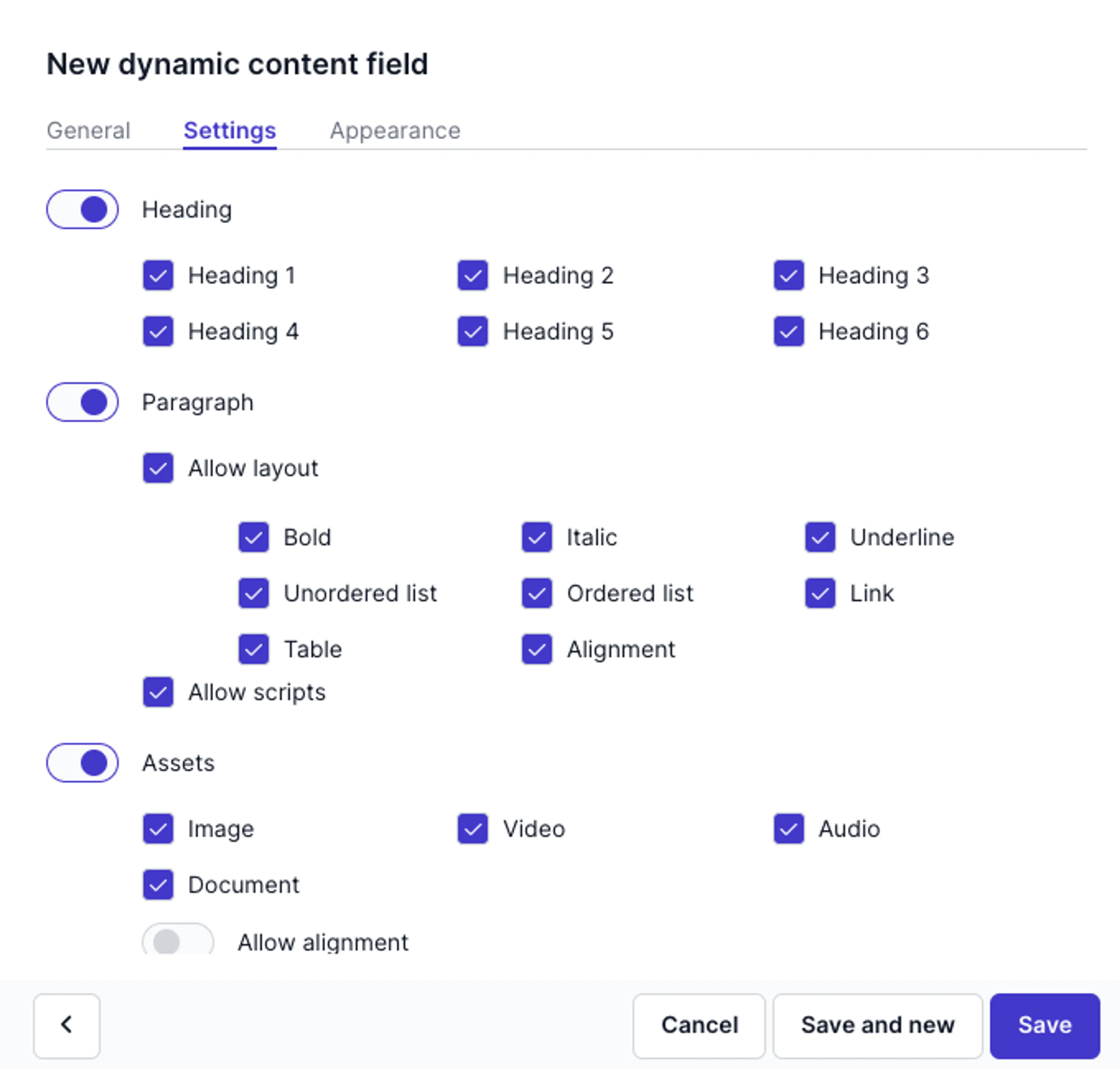

| Settings | Description |
|---|---|
| Heading | Enable to allow headings and choose heading 1 - 6. |
| Paragraph | Allow layout - Enable this option and choose from eight formatting options. Allow scripts - Make it possible to copy-paste or add (HTML-)code in a content item. |
| Assets | Enable to allow assets, then choose types of assets and formatting options. |
| Social | Enable to allow one or more of the major social platforms. |
| Other | Enable to include location. |
| Remote sources and forms | Enable to allow editors to include remote content or forms in content items. This option is available when at least one remote source or form integration like HubSpot or Typeform is set up in Prepr. |
| Components | Enable to choose previously created components. A list of components are made available to choose from when this option is enabled. |
Nesting in the dynamic content field
Take care when allowing components in a dynamic content field. A content editor cannot add content to a dynamic content field nested in a dynamic content field. When they see the message below, it could mean the component in the dynamic content field includes a dynamic content field.

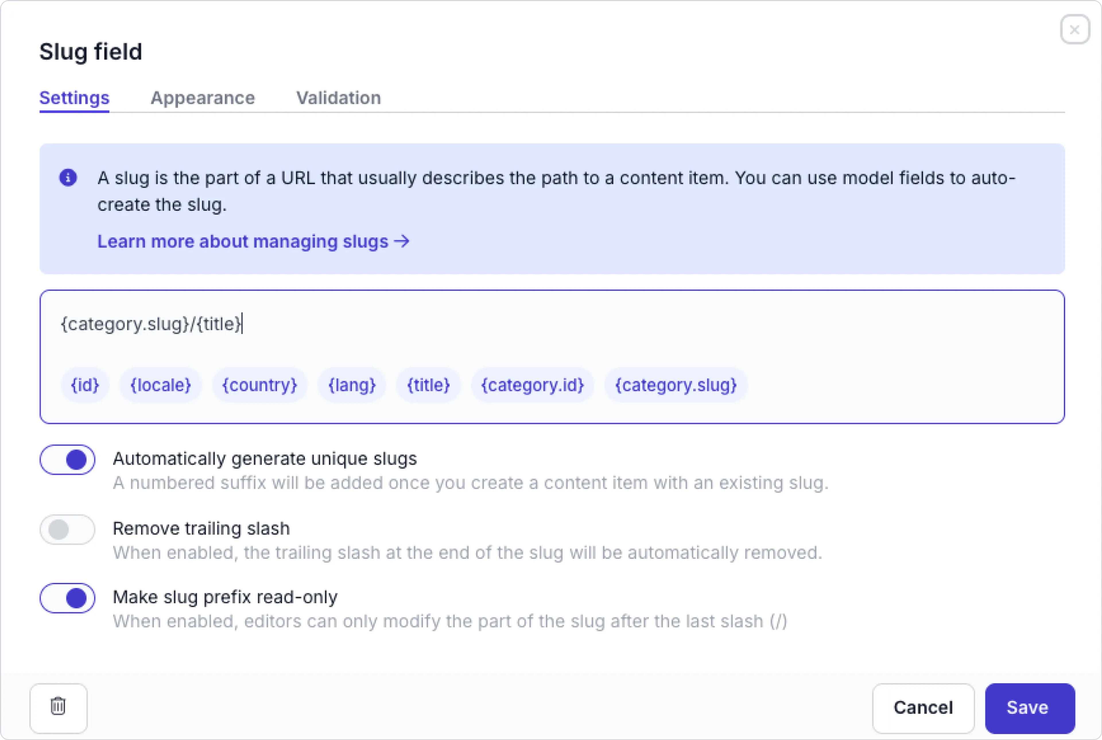
Slug field
A slug is part of a URL that describes the path to the specific content item. It is the part that comes after your domain name in the URL. You can only add one slug field per model.
Fill in the Settings tab as follows:
| Settings | Description |
|---|---|
| Slug template | This value is used to auto-generate a slug value when a content editor creates a new content item or clicks the regenerate icon. Construct the template by clicking the corresponding API name from the list of fields in the info box. The list of fields includes the system fields id, locale, country, lang. The list of fields also include any other Text field, for example: name and excerpt, Content reference field, for example: categories.id and categories.slug, Remote content field, for example e_commerce_product.name, or List field as defined in the model. If any of these fields are not required in a model, a slug can still be generated without those values. In other words, making a field optional in a model allows the field to be omitted when generating a slug. |
| Automatically generate unique slugs | When a new content item is created with a slug value that already exists, Prepr auto-generates a unique slug in the format provided slug template + ’-’ + #, where # is an incremented number, for example, news-article-1 or news-article-2. When this setting is disabled, no unique slug will be generated, but an error will occur to indicate a duplicate content item. |
| Remove trailing slash | This option ensures that slugs never end with a forward slash. If a trailing slash is added manually, it will be automatically removed when the slug field loses focus. This helps maintain clean, consistent URLs across your content. |
| Make slug prefix read-only | When enabled, editors can only modify the part of the slug that comes after the last slash. In other words, the first part of the slug becomes read-only. When this option is disabled, editors can modify the whole slug value. |
Click the Validation tab to set up validation rules:
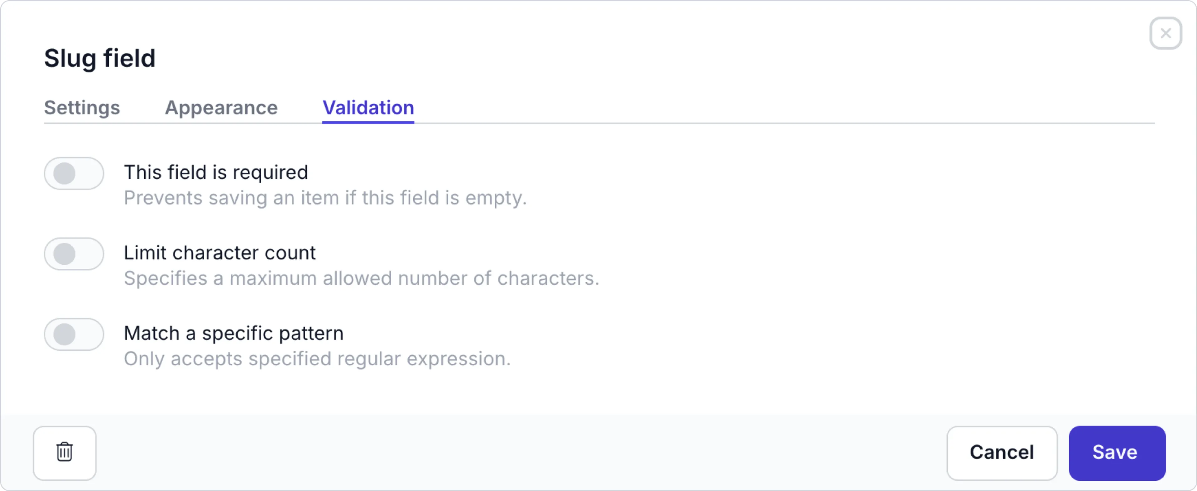
| Validation | Description |
|---|---|
| This field is required | Prevents saving a content item if this field is empty. |
| Limit character count | Specifies a maximum allowed number of characters. This option is useful, for example to make the slug more readable for web app visitors. |
| Match a specific pattern | Only accepts specified regular expression (regex). Validates that the value of a field matches a specific pattern defined by a regular expression. |
For an example on how to use the slug field, check out the preview URL setup guide.
Boolean field
This field allows content editors to choose one of two possible values.
You can define these values in the Appearance tab.
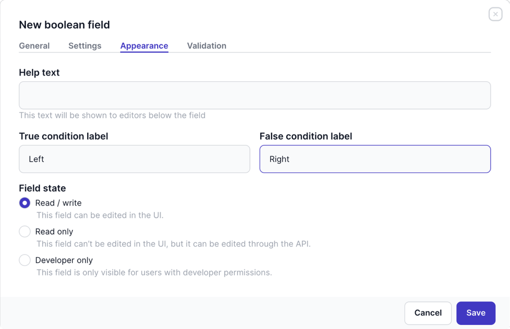
| Appearance | Description |
|---|---|
| True condition label | Specify a label for a true value |
| False condition label | Specify a label for a false value |
In the Settings, you can choose the Default value. When the content item is created, this value will be set automatically and a content editor can overwrite it, if needed.
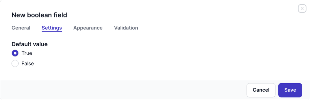
If content items already exist for the model, a confirmation modal appears when you save the field.
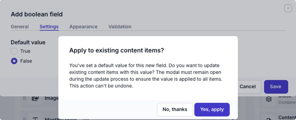
Click the Yes, apply, button in the modal to automatically update all linked content items with the Default value.
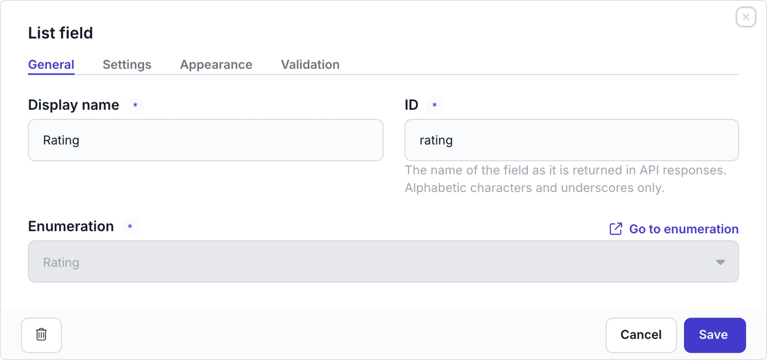
List field
Adding list field to a model or component allows content editors to make a choice out of the given options.
From the General tab, choose an enumeration with the key-value pairs you need for this list.
Click the Settings tab to hide this field from the content item filter menus by disabling the Show in filters setting.
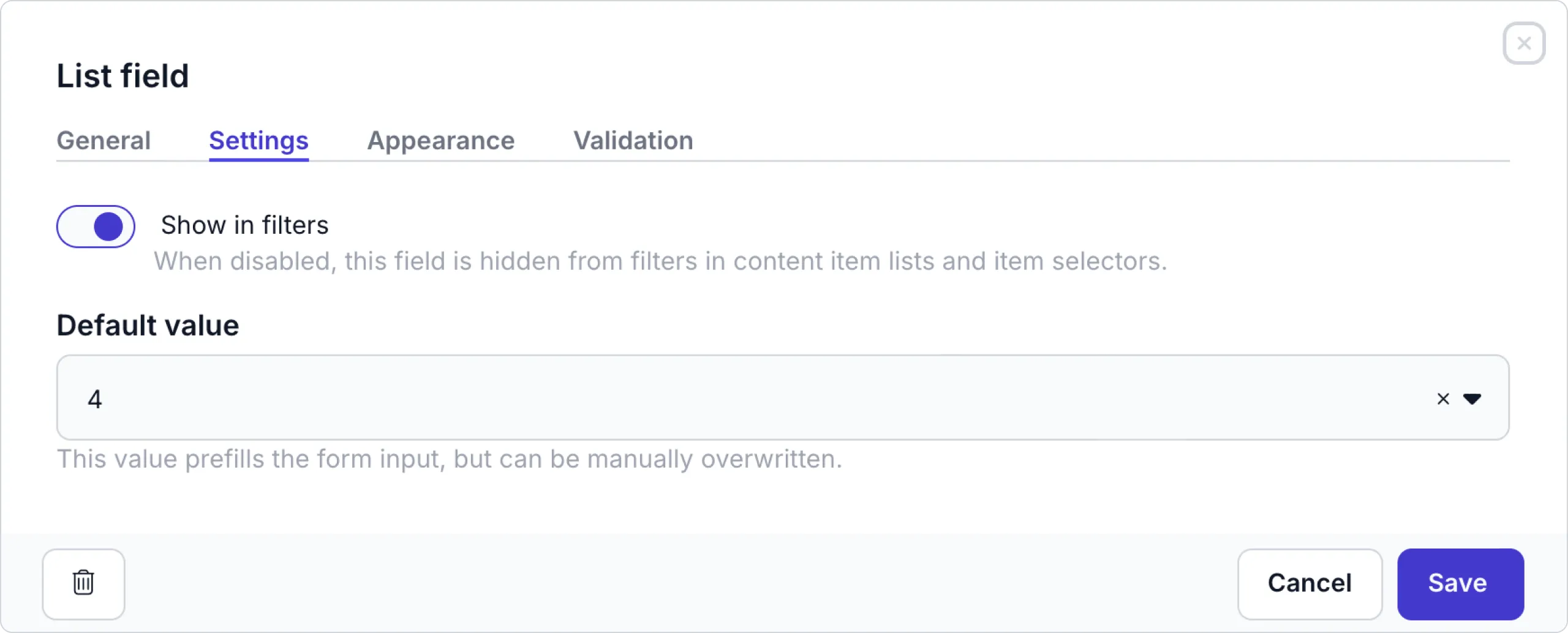
You can also set a Default value. The value entered here is automatically prefilled on the content item, but content editors can overwrite this value manually.
When you enter a Default value and content items already exist for the model, a confirmation modal appears. Click the Yes, apply button to automatically update all linked content items with this value.
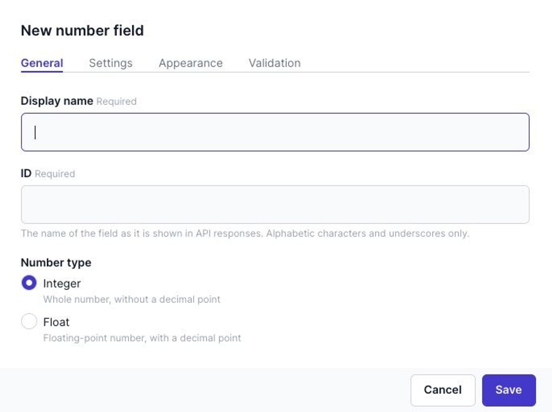
Number field
The number field can be useful when you want to add numerical data to your content item. For example year of birth, stock number, or product prize. The Integer and Float fields can hold 32-bit safe values.
From the General tab, you can choose the Number type: Integer or Float.
Click the Settings tab to set an Initial value. The value entered here is automatically prefilled on the content item, but content editors can overwrite this value manually.
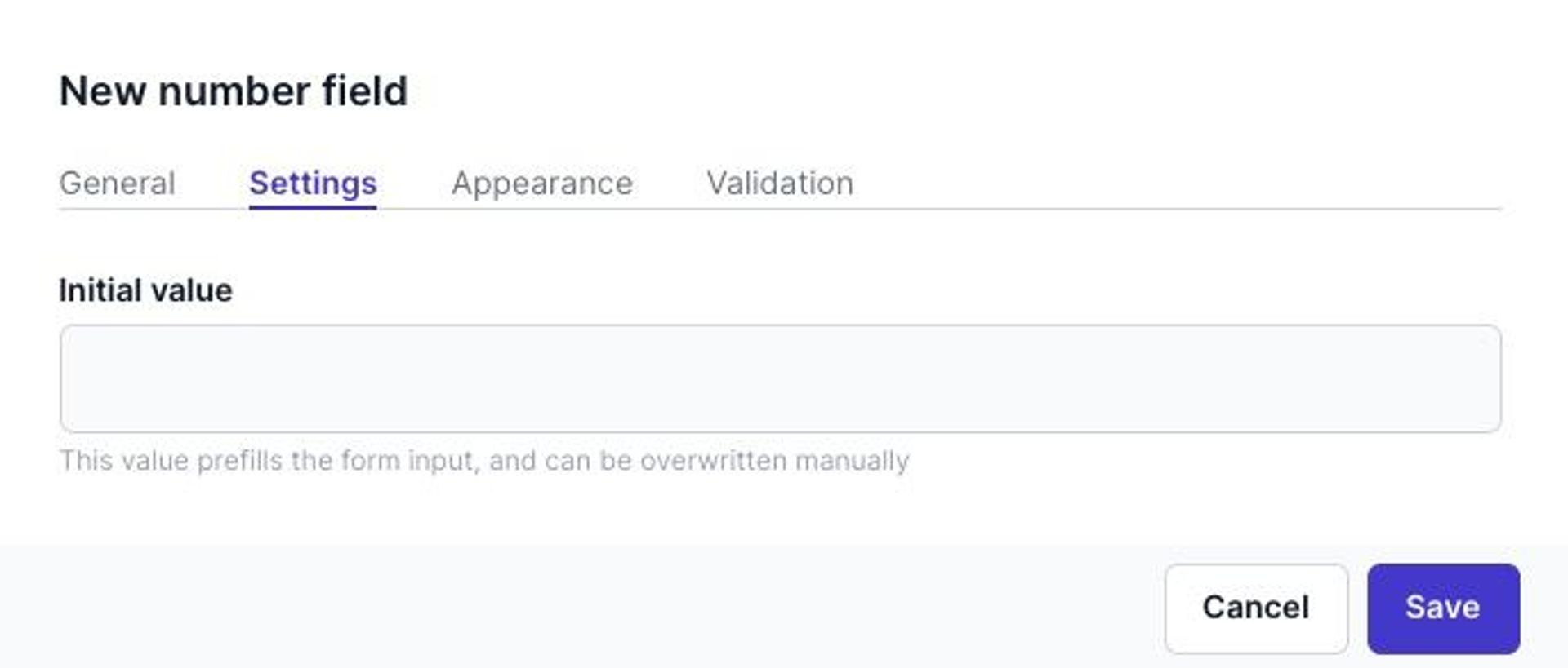
When you enter an Initial value and content items already exist for the model, a confirmation modal appears. Click the Yes, apply, button in the modal to automatically update all linked content items with this value.
Click the Validation tab to enable validation rules.
| Validation | Description |
|---|---|
| This field is required | Prevents saving a content item if this field is empty. |
| This field must be unique | Prevents saving a content item if this field value already exists for this field in another content item. |
| Limit input | Enable this option to set a minimum and maximum allowed value. |
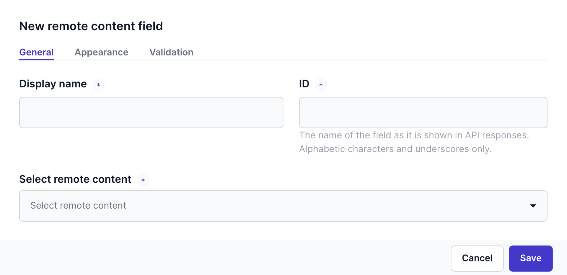
Remote content field
The Remote content field allows editors to use content maintained in an external system in content items.
On the General tab, name the field and choose the desired remote source. For more details, see the available integrations.
The Remote content field is available when at least one remote source is set up in Prepr.
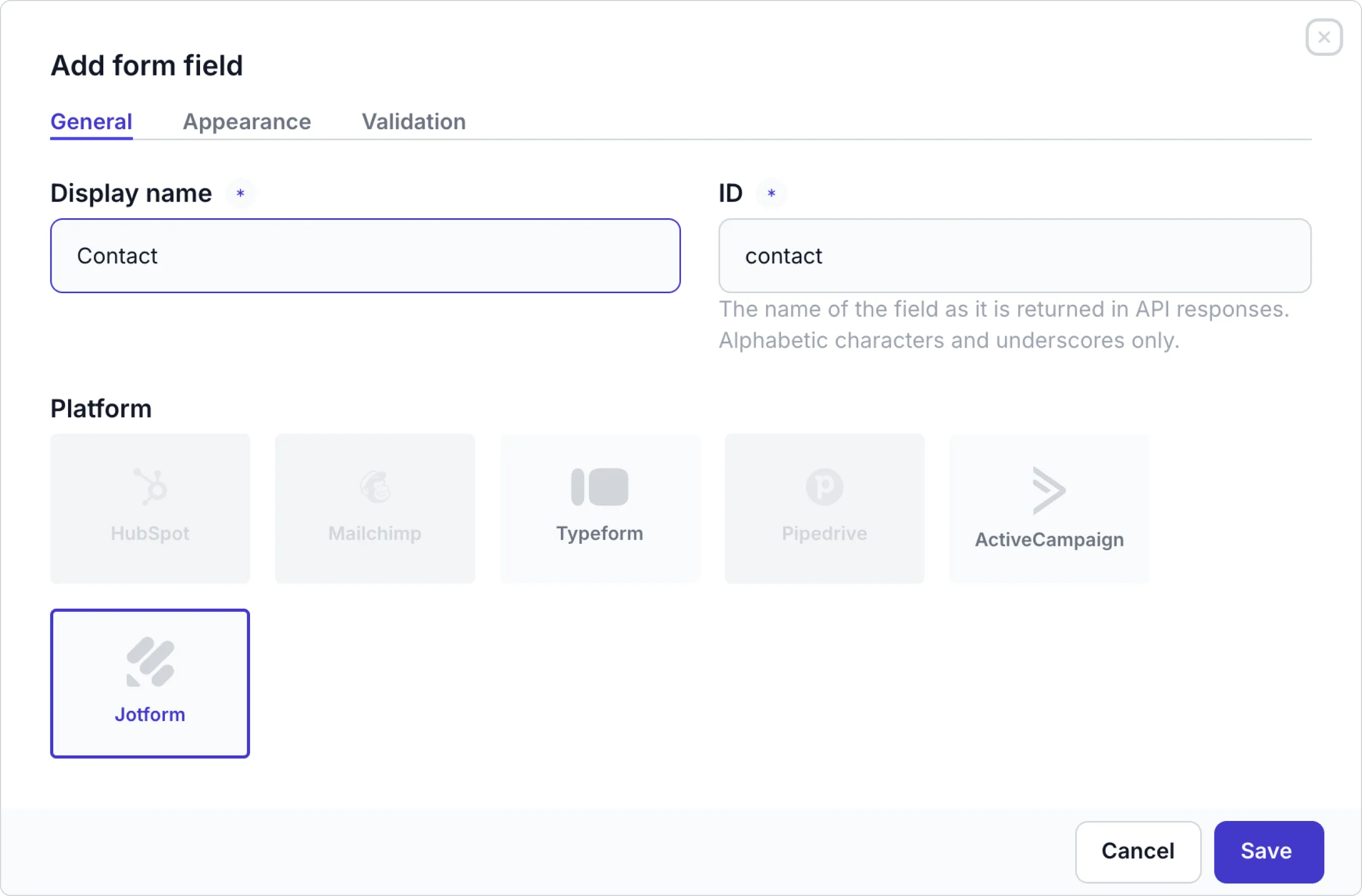
Form field
The Form field allows editors to include forms from an external system like HubSpot or Typeform in content items.
On the General tab, name the field and choose the platform where the form comes from.
The Form field type becomes available in the model or component after activating either the HubSpot, Typeform, Pipedrive, ActiveCampaign or Jotform integration.
For other options, check out the basic field settings.
Embed HTML field
You can easily use Prepr content on your front-end with the embed field. This kind of embedded code is short code, usually in HTML language for users to copy and paste into a website. This is useful when you want to include content in Prepr in another website.
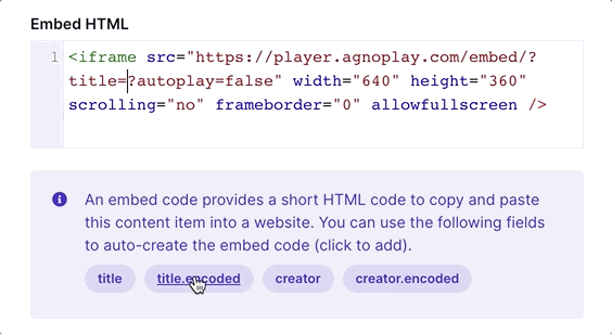
Click the Settings tab and enter the default embedded HTML, such as iFrame code. Choose variables (embed fields) to add data dynamically from other fields.
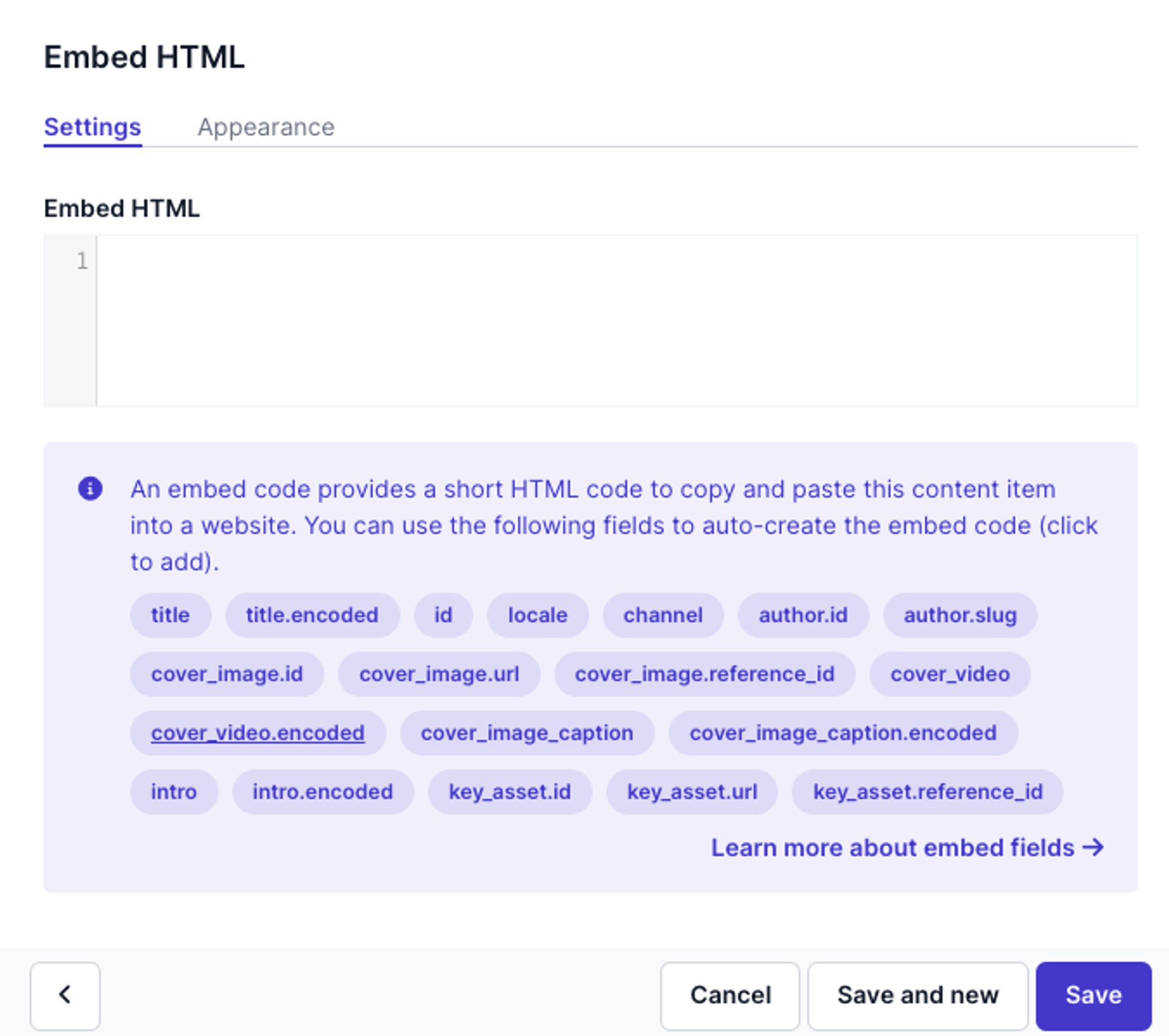
Using plain text or HTML encoded variables
By default, you can pre-fill the title and ID of the content item, but you can also choose to add other fields to your embed structure. You can only use API IDs of fields that you have added to your model. Each text field will generate a plain text variable as well as an encoded variable.
When using embed codes, it can be necessary to use encoded URLs, so that specific characters are encoded to an HTML structure (f.e.: spaces are encoded into %20 characters). To use an encoded variable, click the .encoded field to add.
Building the embed code
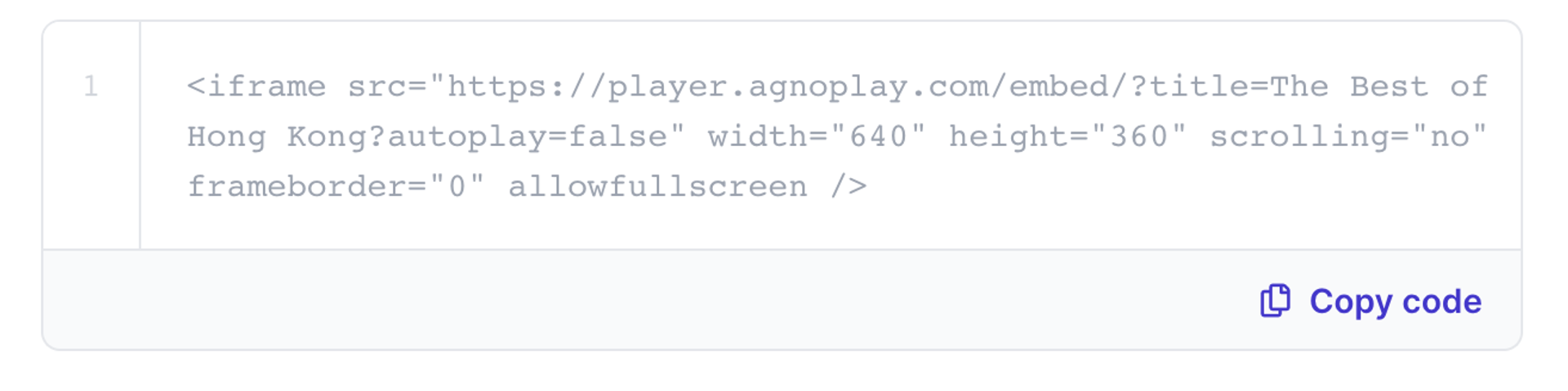
Once you have added the embed HTML to your model, you will see this field in all content items of this model. All variables (API IDs) are replaced in real-time with the data you enter in your content item.
Plain text embed
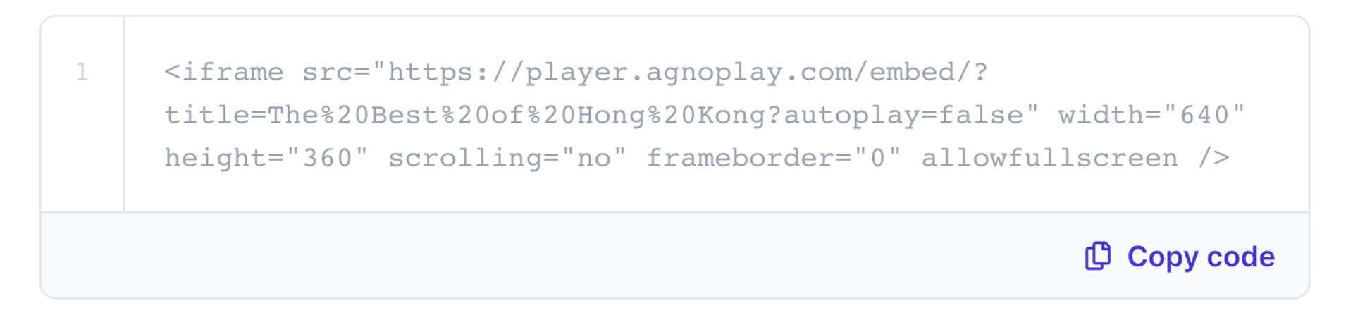
Encoded embed
Using the embed code
To use the embed code on your front-end or a third-party website, simply click ’ Copy code’ to save the embed code to your clipboard.
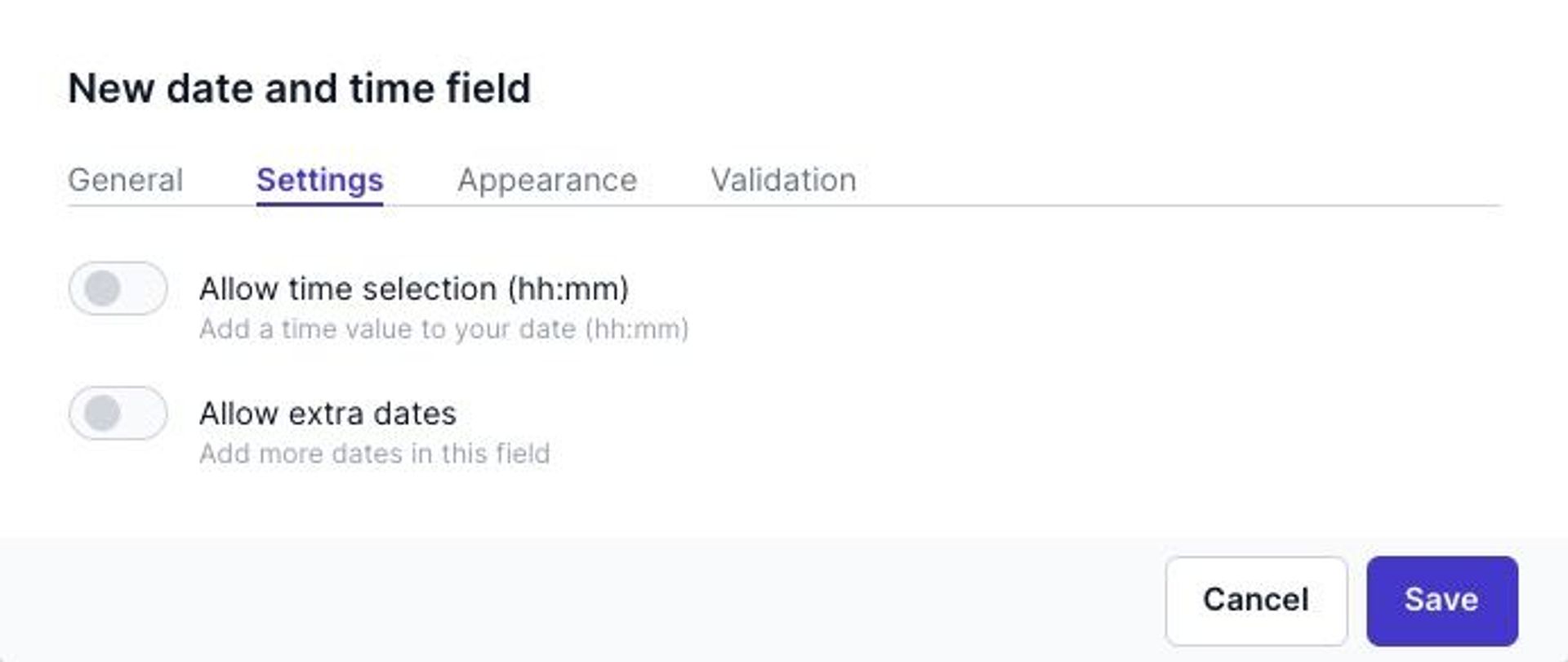
Date and time field
The field Date and time allows content editors to add dates and times to your content items.
From the General tab, choose a Type as follows:
- Date - A date-only field
- Date range - A start date and end date
- Business hours - A day and time picker to enter AM and PM openings hours.
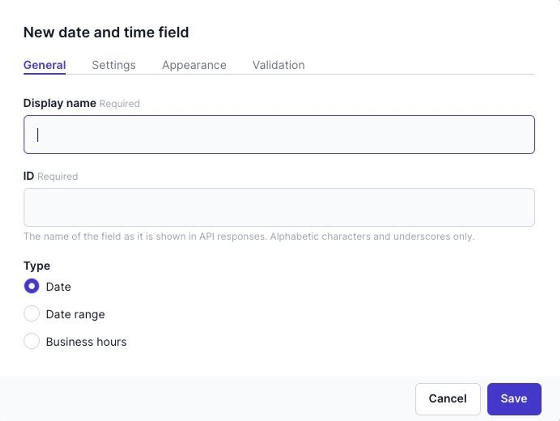
Click the Settings tab and fill the settings as follows:
| Settings | Description |
|---|---|
| Allow time selection (hh:mm) | Enable this option to add a time to your date or date range. |
| Allow extra dates | Enable this option to use multiple date or date ranges. |
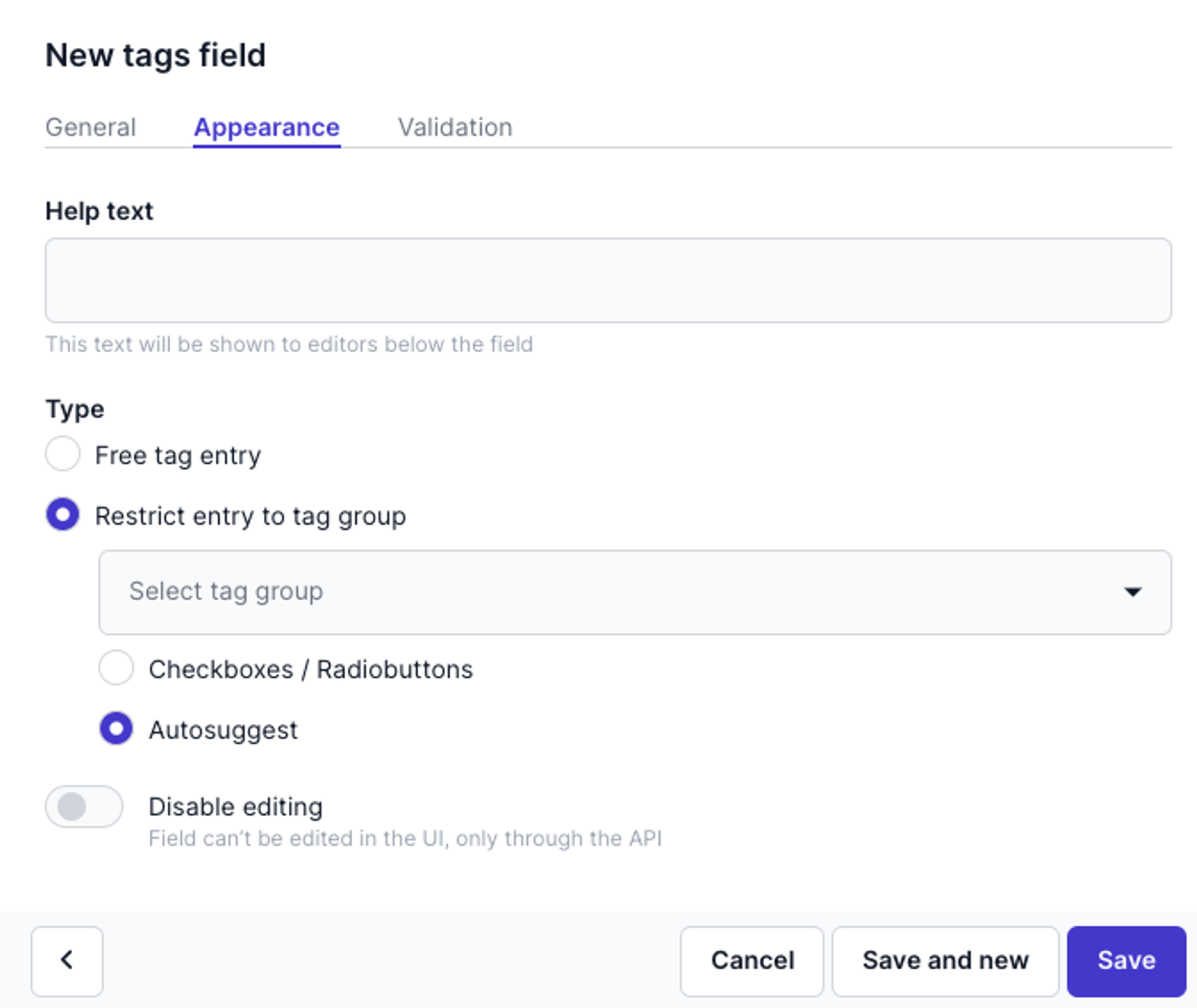
Tags field
This field allows content editors to add tags to your content item.
In the Appearance settings, choose one of the follow Type values:
- Free tag entry
- Restrict entry to tag group
- For the Restrict entry to tag group option, choose a predefined tag group and choose either Checkboxes / Radiobuttons or Autosuggest
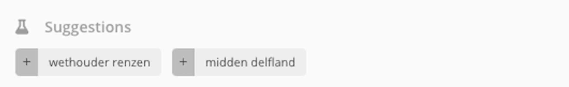
If you have the SEO score option selected in a model, tag suggestions will be visible as the Free tag entry field. For example:
A Tag group is a way to group related tags, for example, a tag group called Article category has a list of tags each of which is an article category. To create a new tag group, click the icon and go to Tag groups → Add tag group.
Location field
The field Location allows content editors to add Google Maps geo-points (coordinates or an address) to your content item.
See the Basic field settings on how to add a Location field to a model. Check out Adding elements to a content field for an example on how location content is added.
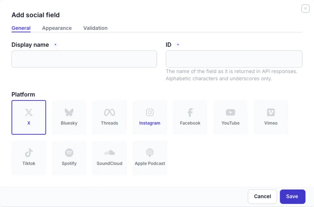
Social field
Prepr supports several social embeddings. You can select one of them for each social field. In a content item, editors can copy and paste a social URL. Prepr will generate a preview of the social post.
From the General tab, select the type as follows:
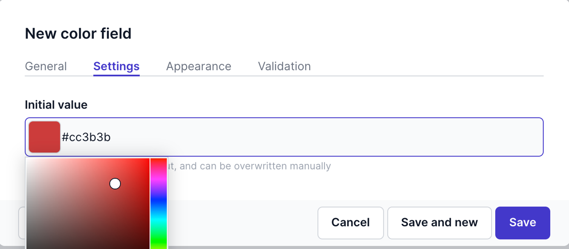
Color field
The color field allows content editors to choose a color. For example, this is useful when you want to manage your front-end styling in Prepr.
Click the Settings tab to set an initial value. This means that the value is prefilled on the content item automatically. This value can be overwritten manually.
Help text field
Unlike other fields, the help text field is not an entry in a content item. This field is a definition of how to display any additional guidance instructions in a content item.
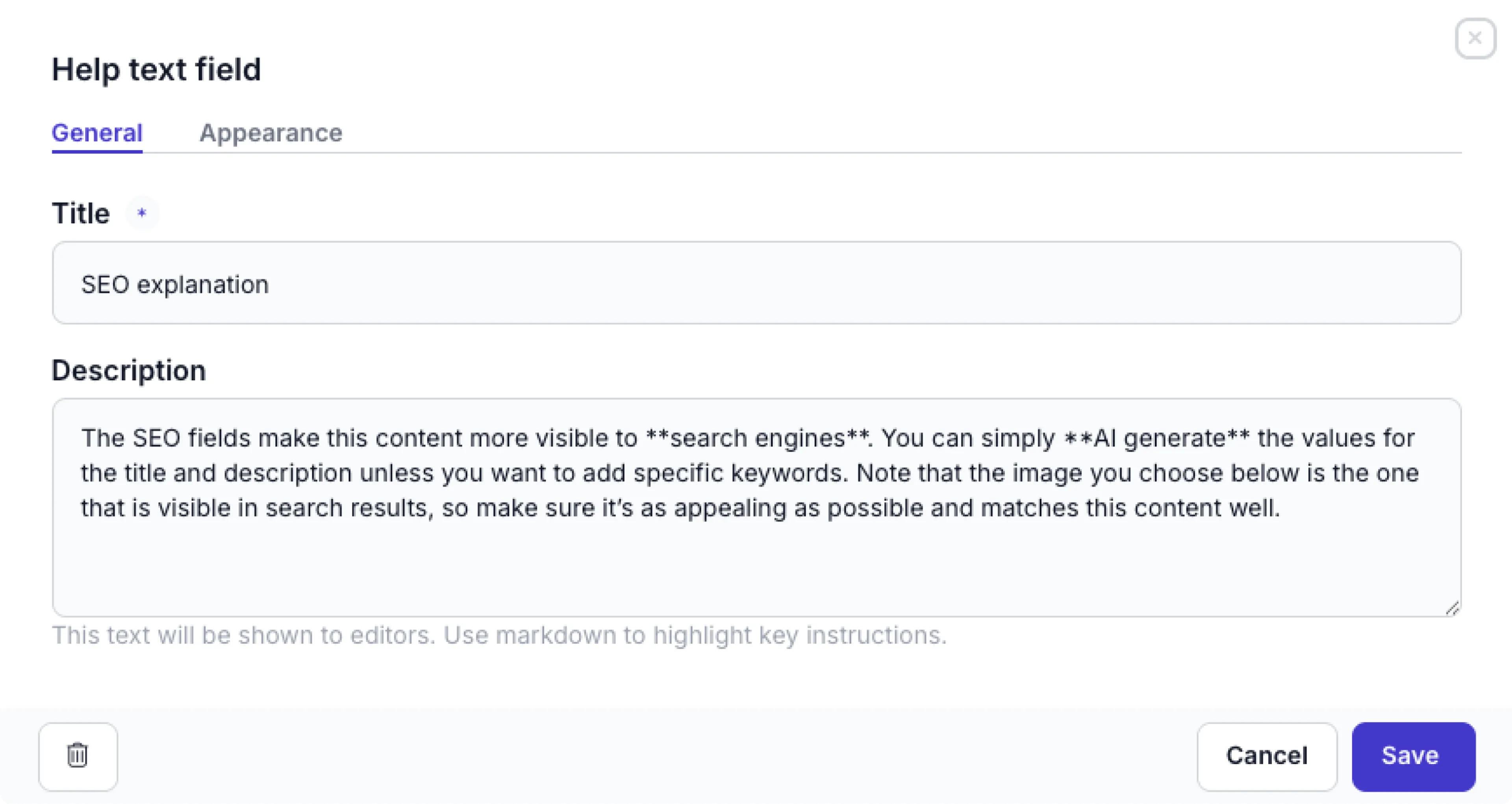
When you add a help text field, simply set a Title that appears in bold at the top of an information box. Add your instructions or help text in the Description value. You can use standard Markdown to highlight key instructions.
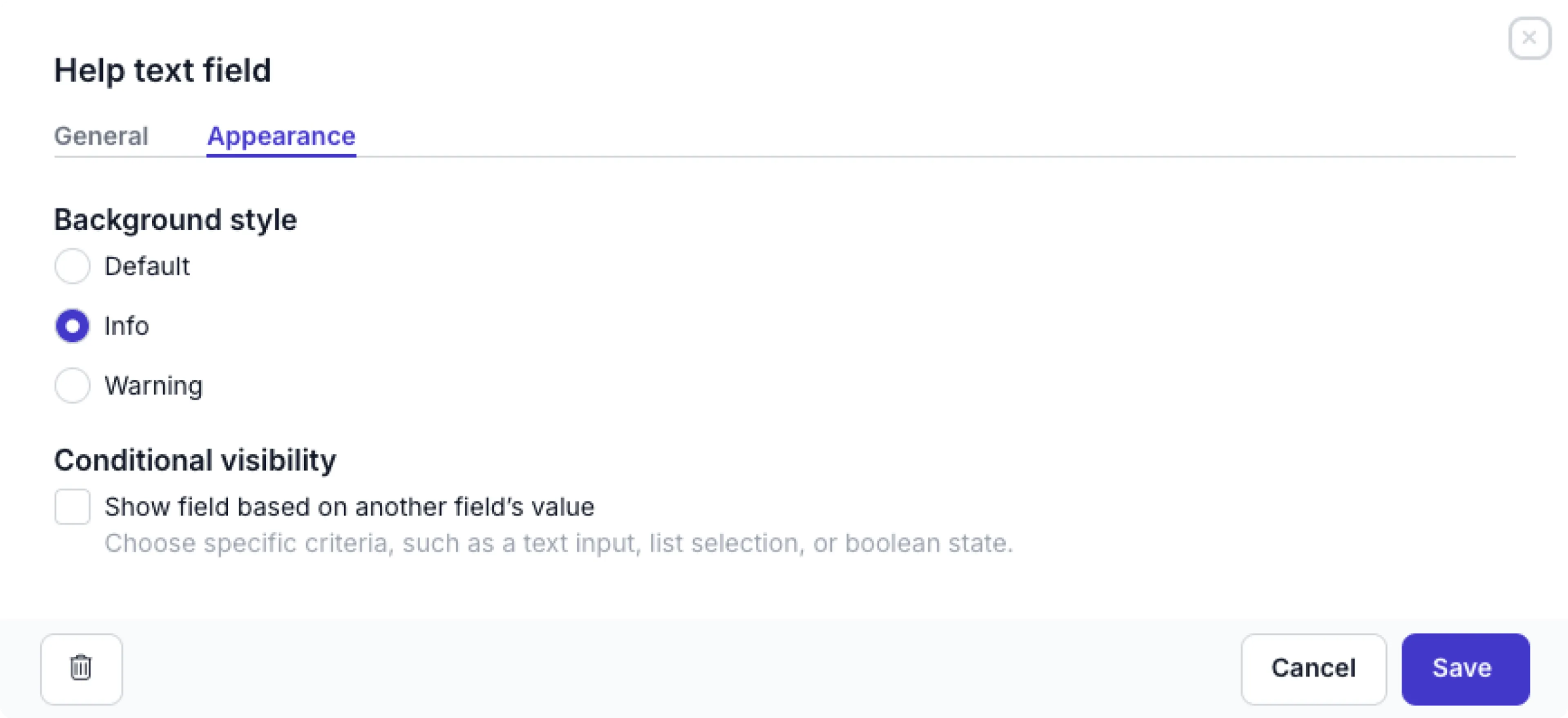
Go to the Appearance tab to set the Background style. You can customize the background color by choosing Default (light gray) Info (blue) or Warning (yellow) to highlight appropriate guidance. Check out the common settings for details on how to set up the Conditional visibility.
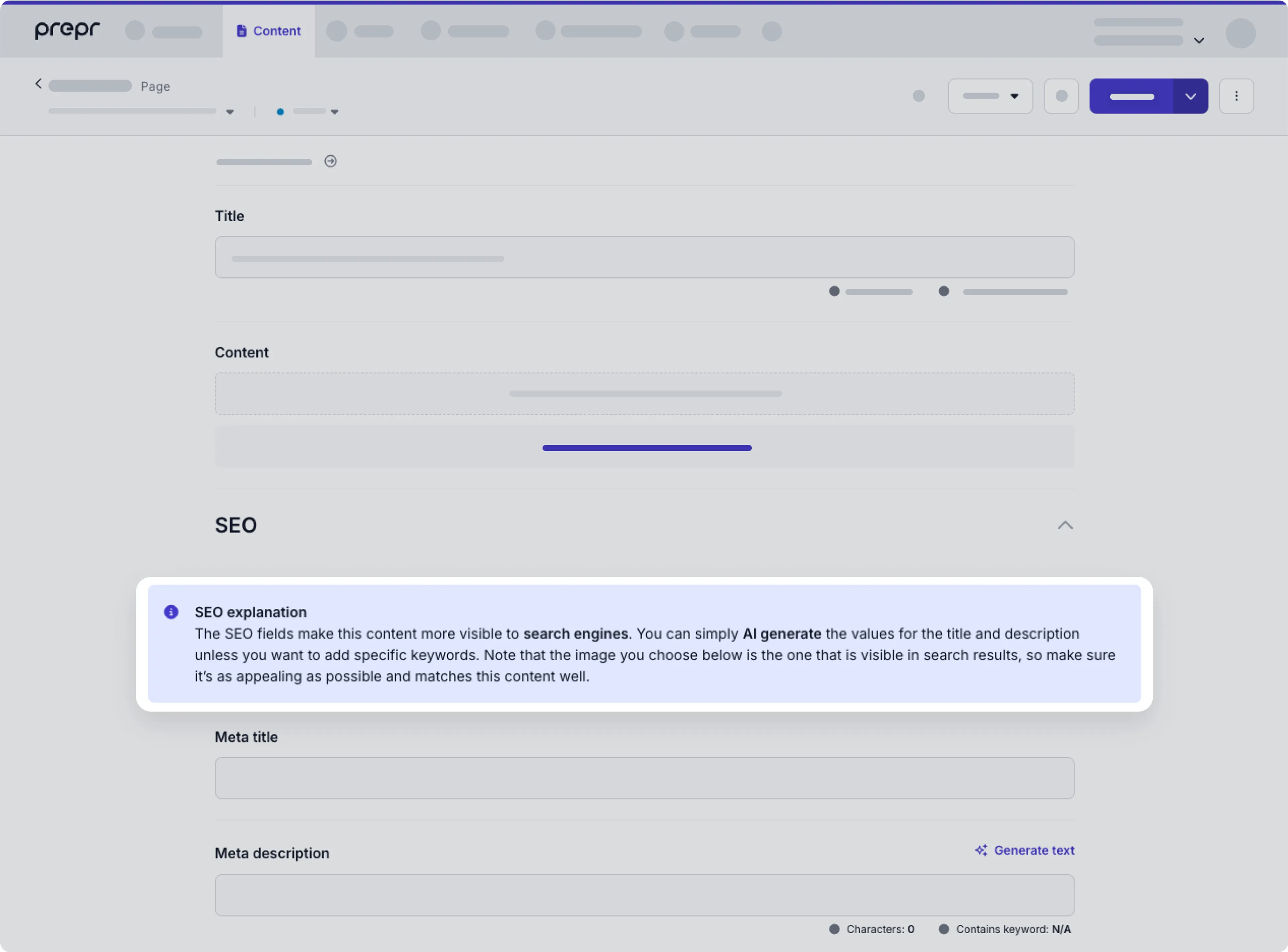
The instructions will appear in a highlighted box in the position you add the field in the model or component. In the example below, the field was added as the first field in the SEO component.
For simpler help text with placeholder or tooltip options, check out the Appearance settings for any field.